CardBox
This section assumes you are very familiar with the concepts, terms and ideas for protograf as presented in the Basic Concepts , that you understand all of the Additional Concepts and that you’ve created some basic scripts of your own using the Core Shapes. You also be familiar with the various types of shape’s properties described in the Customised Shapes
Overview
The CardBox() command allows you to create template that, when printed,
can be cut out and folded to create a box. This is useful to store a deck of
cards; or can just be used as a storage box.
These kinds of boxes are often known as tuck boxes.
Hint
The documentation shows images of such templates as PNG files. However, if you want to actually print and assemble the box templates, you should use the PDF version that is always generated!
CardBox Properties
The basic CardBox() properties are the same as many other shapes and
objects:
x and y values can be set to offset the top-left “corner” of the box template from the page margins.
stroke and stroke_width set the style of the outline of the box template
fill sets the color of the interior of the box template.
In addition to the above, the CardBox() command has a number of properties
that can be set to customize how the box template will appear.
The key size of the box can be set using:
card_size - using the name of a standard/common card type will set both the height and width e.g.
poker,bridge,minietc. The default card size ispoker.height - a value, in the chosen or default units, of the box height (use this if you are not setting a card_size)
width - a value, in the chosen or default units, of the box width (use this if you are not setting a card_size)
depth - a value, in the chosen or default units, of the box depth; if not set, it defaults to approximately
2cm — the height of deck of 54 standard playing cards
The padding refers to the amount of extra space allocated to the height and width in order to allow for a better “fit” inside the box:
padding - the value, in the chosen or default units, of the total extra amount added to each of the height and width values
padding_height - the value, in the chosen or default units, of the extra amount added to the height value
padding_width - the value, in the chosen or default units, of the extra amount added to the width value
The folds indicate the lines at which the template must be folded in order to create the box shape. These properties can be set:
fold - when set to
Truewill cause the fold lines to be shownfold_stroke - sets the color of the fold lines
fold_stroke_width - sets the thickness of the fold lines
The flaps are the “non-visible” parts of the box that get tucked or glued inside of it when folded. Their default sizes are calculated in proportion to the key sizes. Their heights can be set directly:
flap - the height, in the chosen or default units, of the main flaps (the ones attached to the top/front and bottom/back)
flap_inner - the height, in the chosen or default units, of the smaller flaps (the ones attached to the right and left sides)
flap_glue - the width, in the chosen or default units, of the long thin flap attached to the side of the front area; this flap is designed to be glued to the back of the left side
Various other properties can be set:
rounded - when set to
Truewill changes the style of the main flapsthumb - the value, in the chosen or default units, of the diameter of a half-circle drawn at the top of the back of the box
Finally, the other useful properties that can be set are for what needs to be displayed on the various visible locations of the folded box. These locations include the front, the back, the left side, the right side, the top and the bottom (or underneath).
For each of these different areas, one or more shapes can be allocated to appear in that area.
The shapes are automatically placed in the center of the area to which they are
allocated. If there are multiple shapes, they should be in a list (inside
[ … ] brackets), and they will be drawn in order from left to right.
In other words, the leftmost shape is drawn first and the following shapes
are drawn over each other in sequence.
The locations for the shapes are all identified by the prefix shape_,
followed by the area name: shape_front, shape_back, shape_left,
shape_right, shape_top and shape_bottom.
Hint
Bear in mind that, depending on how you want the box to appear once it
has been folded and glued, some of the shapes may need to be rotated;
in particular, shape_left, shape_right, and shape_bottom.
CardBox Examples
The examples below shows how a CardBox can be created and styled.
The examples are shown on a A5-size page, landscape orientation, with
a background grid (1 cm squares) and 0.25 cm (~1/10”) margin.
The code for this is:
Create(
    filename="cardbox.pdf",
    paper="A5-l",
    margin=0.25,
    page_grid=1,
)
Note also that for purposes of easy viewing, the line thicknesses of the first two examples have been increased; if the images are still unclear, then click on them to see a larger view.
Example 1: The default CardBox
|
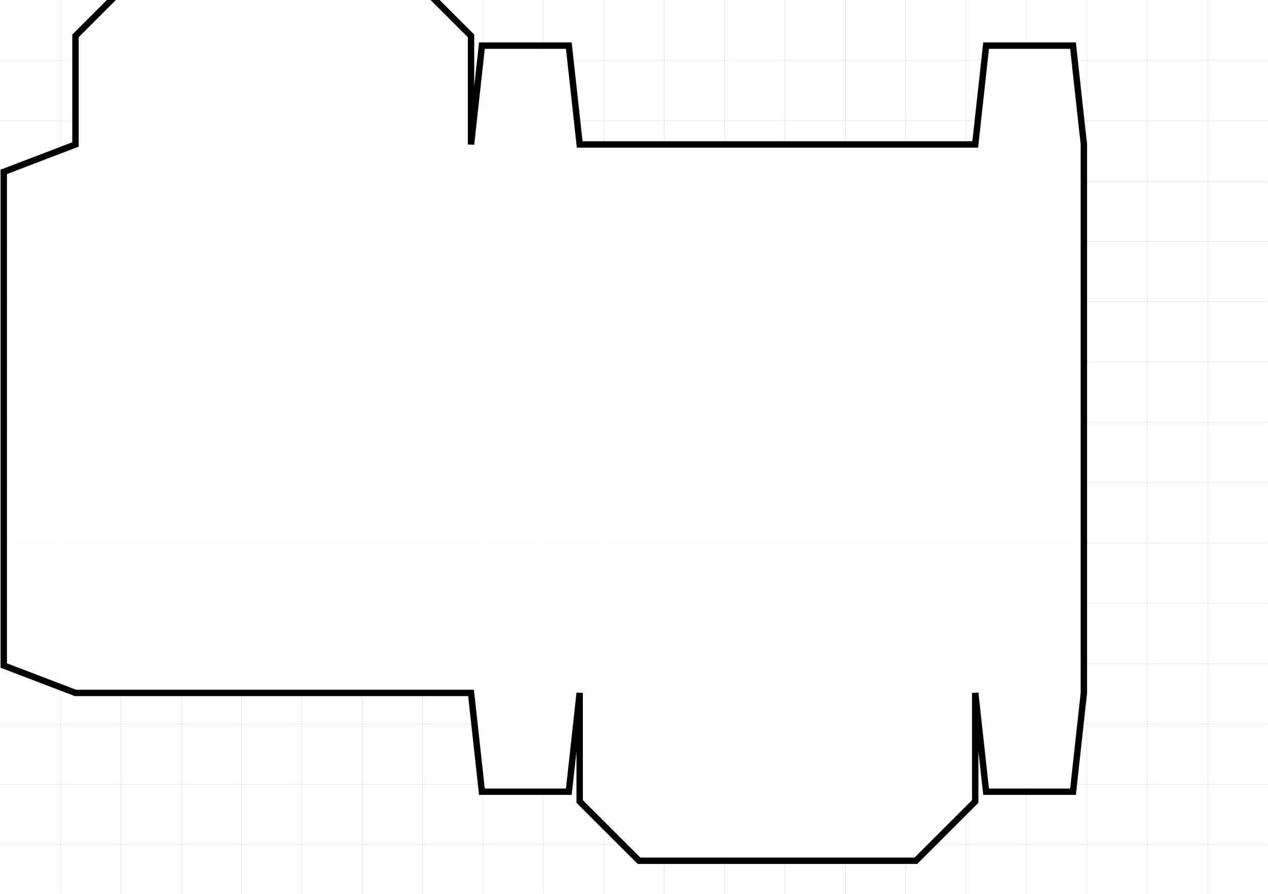
This example shows a CardBox object constructed using these commands: CardBox()
All of the CardBox shapes are constructed with same basic layout: the front, right, back and left areas in sequence across the midddle with the top atached to the front and the bottom attached to the back. The default template is designed to house a standard playing card deck of Poker-sized cards. The default padding for these cards is 2mm. Part of the top flap has been cut off — normally, the y value would be set higher to “move” the template downwards. |
Example 2: CardBox Properties
|
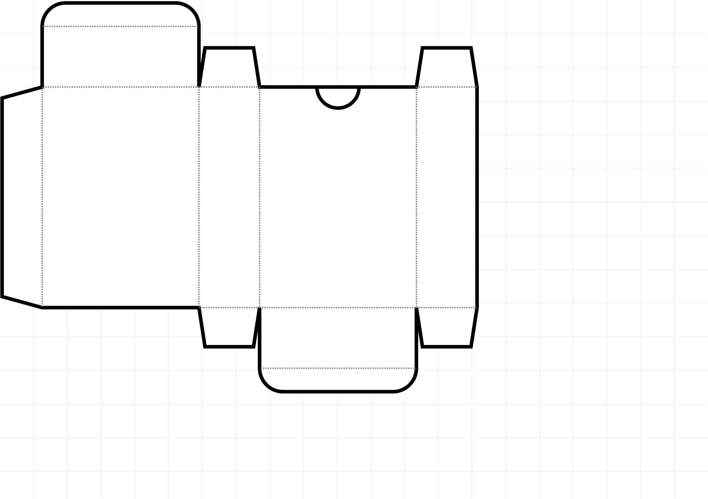
This example shows a CardBox object constructed using these commands: CardBox(
card_size="Mini",
stroke_width=3,
fold=True,
fold_stroke_width=1,
rounded=True,
thumb=1.25,
)
All of the CardBox shapes are constructed with same basic layout: the front, right, back and left areas in sequence across the midddle with the top atached to the front and the bottom attached to the back. The customisation here involves:
|
Example 3: CardBox Shapes
|
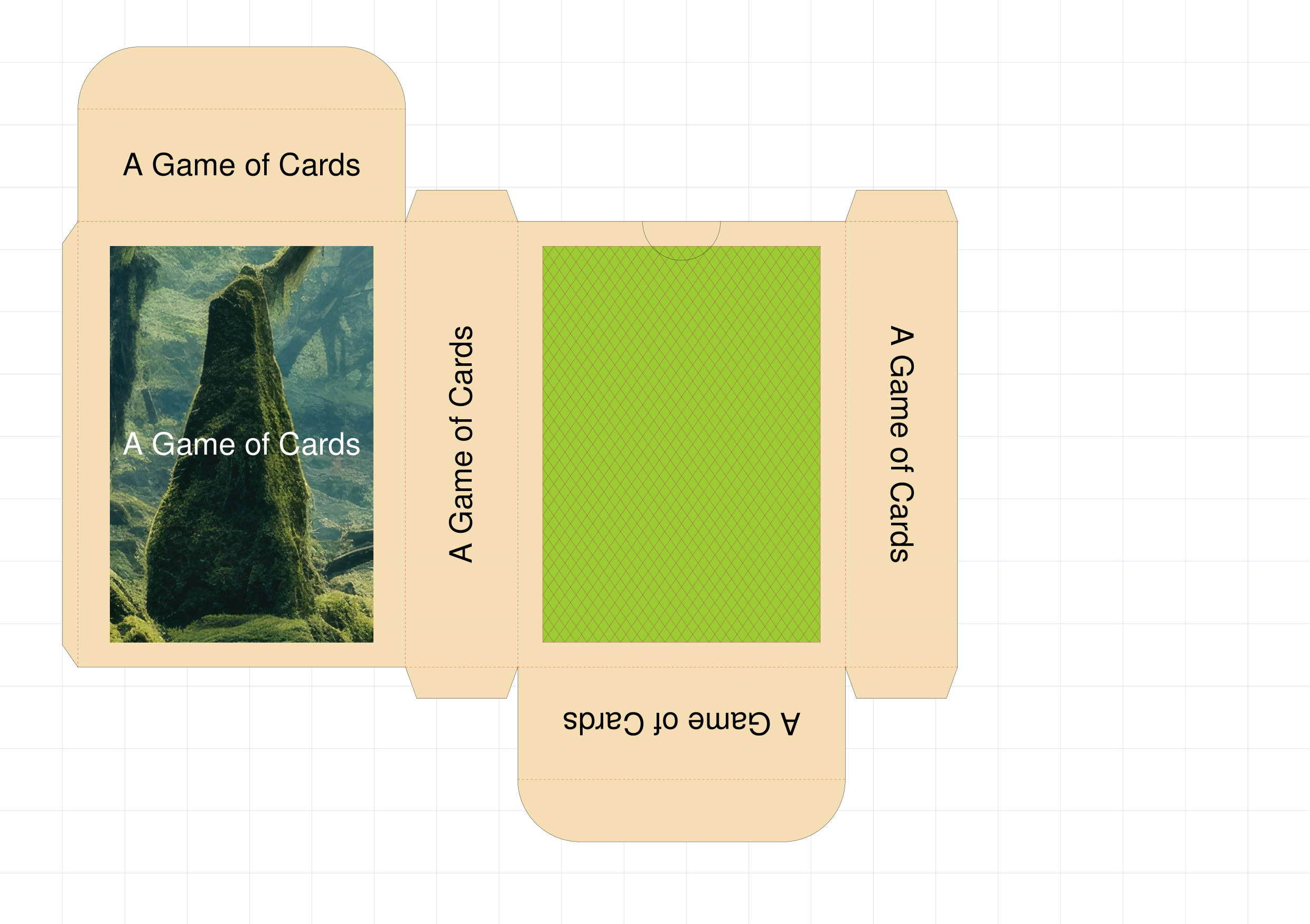
This example shows a CardBox object constructed using these commands: front = image(
"images/mff-crop.jpg",
height=6.35, width=4.45)
back = rectangle(
stroke="maroon", fill="yellowgreen",
height=6.35, width=4.45,
hatches='d', hatches_count=50,
hatches_stroke="maroon")
name = Common(
text="A Game of Cards", font_size=14)
name_up = text(common=name)
name_front = text(common=name, stroke="white")
name_top = text(common=name)
name_btm = text(common=name, rotation=180)
name_lft = text(common=name, rotation=-90)
name_rgh = text(common=name, rotation=90)
CardBox(
card_size="Mini",
fold=True,
rounded=True,
thumb=1.25,
fold_stroke="red",
fill="wheat",
padding_width=0.8,
padding_height=0.8,
flap=1,
flap_glue=0.25,
flap_inner=0.5,
shapes_front=[front, name_front],
shapes_back=back,
shapes_top=name_top,
shapes_bottom=name_btm,
shapes_left=name_lft,
shapes_right=name_rgh,
)
All of the CardBox shapes are constructed with same basic layout: the front, right, back and left areas in sequence across the midddle with the top atached to the front and the bottom attached to the back. In addition to the same kind of customisation shown above in Example 2: CardBox Properties the following are also set:
In addition, various shapes are assigned to the different areas of the box template. Shapes are pre-defined in the preceding script and assigned
a name so they can be referenced by the Note that shapes assigned to three of the area properties — shape_right, shape_top and shape_bottom — have all been rotated. |
Useful Resources
Obviously protograf is not the only tool capable of creating box templates. There many other tools; some of which are listed below.
Inclusion of these resources does not constitute a recommendation! As always, check how they are allowed to be used and any terms and conditions.
In addition, BoardGameGeek hosts a page listing similar resources at https://boardgamegeek.com/wiki/page/Tuck_boxes
Finally, https://www.magicianmasterclass.com/post/playing-card-box-template has helpful illustrated instructions for cutting out and assembling a box.