Core Shapes
These descriptions of the available shapes assume you are familiar with the concepts, terms and ideas for protograf as presented in the Basic Concepts - especially units, properties and defaults. It will also help to at least browse through the section on Additional Concepts.
Shape Index
Overview
Where possible, the basic examples first show how a shape would appear on a page when only the default properties are used. This means that, for most cases, that lines are drawn in black and shapes that have an enclosed area are filled with a white color. The default length, width or height in most cases is 1 cm. The main change from default, for these examples, has been to make the default line width (stroke_width) thicker for easier viewing of the small PNG images that have been generated from the original PDF output.
Most shapes can be styled by setting one or more of the Shapes Common Properties. Other shapes have additional properties available that allow even further styling.
To make it easier to see where and how a shape has been drawn, most of these examples have been created with a background grid, which protograf refers to as a Blueprint shape, added to the page — a small A8 “business card” size — for cross-reference.
Note
The graphics for these examples were generated from either of the following scripts; default_shapes or customised_shapes. protograf first creates a PDF, then generates a PNG file for each page in the PDF.
Commonalities
There are some properties that can be set for almost all of the shapes; examples of these are presented in the section on Shapes Common Properties at the end, rather than being described in detail for every single shape.
Hint
Bear in mind that if a property that it does not support is provided for a shape, then that property and its value will simply be ignored.
Linear Shapes
Arc
An Arc is a curved line between two points located along the circumference of a circle.
Hint
To create the “area equivalent” of an Arc, use a Band.
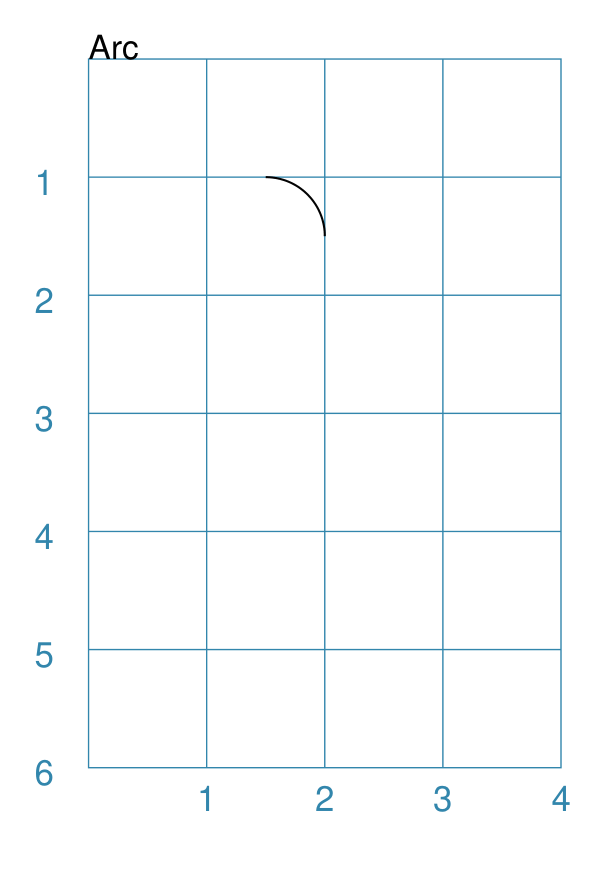
Example 1. Default Arc
|
This example shows the shape constructed using the command with only defaults: Arc()
It has the following properties based on the defaults:
|
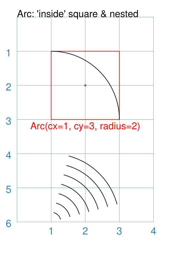
Example 2. Customised Arc
|
This example shows the shape constructed using the command with these properties: Arc(cx=1, cy=3, radius=2)
Arc(cx=1, cy=6, radius=2,
nested=6,
angle_start=15, angle_width=60)
To help with visualisation, the top Arc is surrounded by a red Rectangle: Rectangle(
x=1, y=1, height=1, width=2, dot=0.02,
stroke="red", fill=None,
title="Arc(cx=1, cy=3, radius=2)")
)
The top Arc has the following properties:
The default arc extent is from 0° (the line parallel to the top edge of the page) to 90° (the line parallel to the side edges of the page). The lower Arc has the following properties:
|
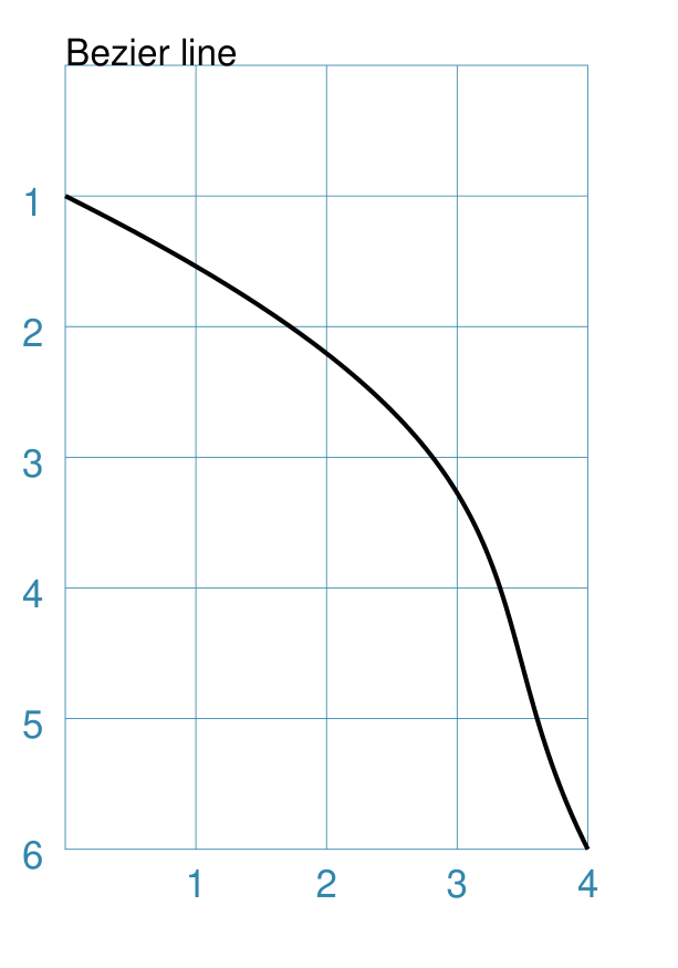
Bezier
A Bezier is a curve that has inflection points, allowing it to “bend”.
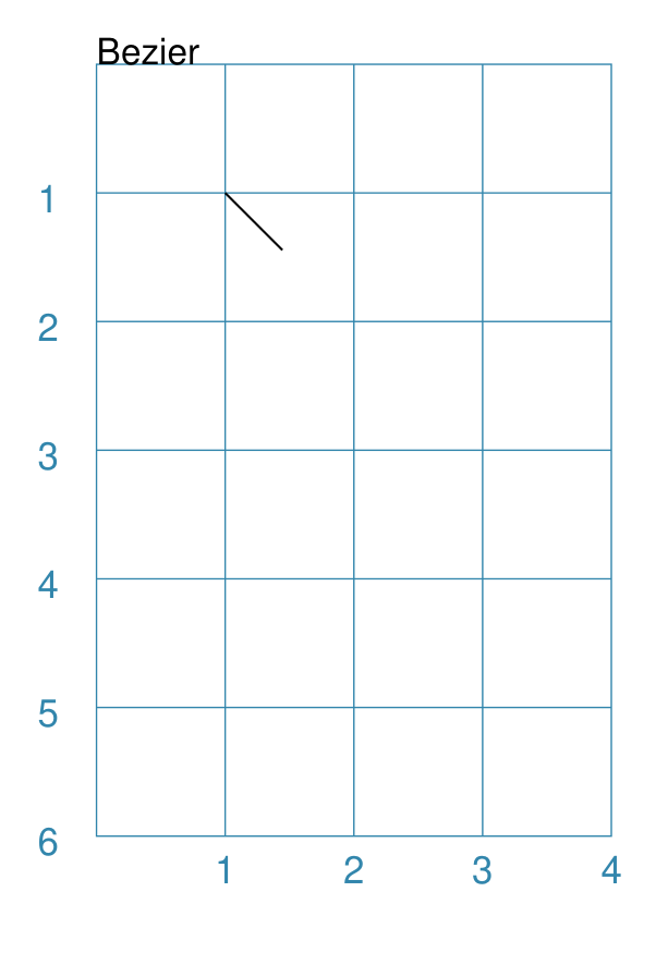
Example 1. Default Bezier
|
This example shows the shape constructed using the command with only defaults: Bezier()
It has the following properties based on the defaults:
|
Example 2. Customised Bezier
|
This example shows the shape constructed using the command with the following properties: Bezier(
x=0, y=1,
x1=4, y1=3,
x2=3, y2=4,
x3=4, y3=6,
stroke_width=1)
It has the following properties based on changes to the defaults:
|
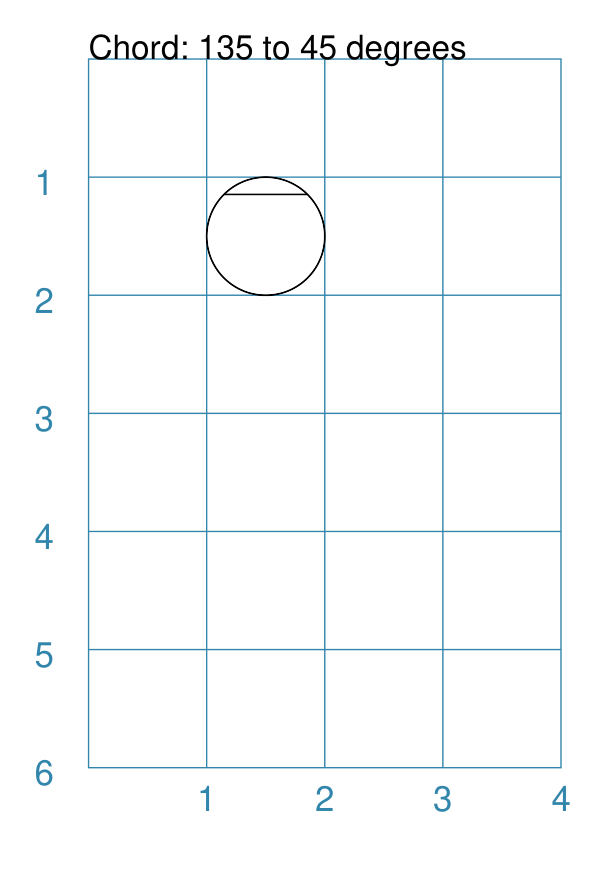
Chord
A chord is a straight line joining two points on a circle’s diameter.
Example 1. Customised Chord
|
If the shape constructed using only default properties, there will be nothing to see: Chord()
This example then shows the shape constructed using the command with these properties: Chord(
shape=Circle(radius=1, fill=None),
angle=135,
angle1=45)
It has the following properties based on these values:
|
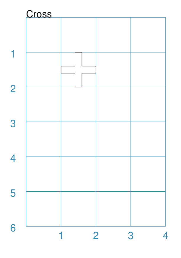
Cross
A Cross shape is two thick bars that cross each other at 90°. The vertical bar is termed the “body” and the horizontal bar is the “arm”.
In addition to the normal, common properties, the Cross also has:
thickness: this is the width of the bars. The default value for this is one-fifth of the overall width.
arm_fraction: this is the fraction along (up or down) the length of the body at which the arm crosses it. The default value for this is
0.5i.e. half-way along.
Note
Unlike most other shapes with a centre, the Cross uses as its centre the middle point of the arm of the cross — rather a centre based on the overall height and width.
Example 1. Default Cross
|
This example shows the shape constructed using the command with only defaults: Cross()
It has the following properties based on the defaults:
|
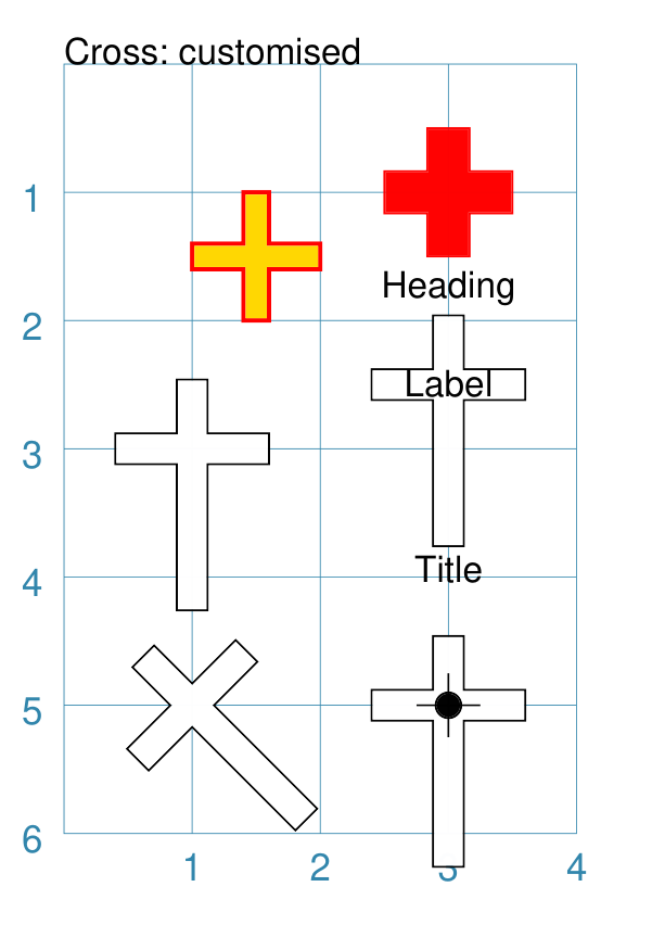
Example 2. Customised Cross
|
This example shows the Cross constructed using the command with thes properties shown. Note the use of the Common command to allow multiple Crosses to share the same properties. crs = Common(
height=1.8, width=1.2,
arm_fraction=0.70)
Cross(
stroke_width=1,
stroke="red",
fill="gold")
Cross(
cx=3, cy=1,
thickness=0.33,
fill_stroke="red")
Cross(
common=crs,
cx=1, cy=3)
Cross(
common=crs,
cx=3, cy=2.5,
title="Title",
label="Label",
heading="Heading")
Cross(
common=crs,
cx=3, cy=5,
dot=0.1, cross=0.5)
Cross(
common=crs,
cx=1, cy=5, height=1.8,
rotation=45)
The top-left example shows a default-sized cross with different fill and stroke colors, as well a thicker stroke_width. The top-right example shows a cross with matching fill and
stroke colors. It also changes the default size of the bar
for the arm and body to have a thickness of The lower four examples all share a common height and width. They
also use the arm_fraction property. This is the fraction up the
length of the body at which the arm crosses it; by default this is
The label and rotation properties are also based on the middle point of the arm of the cross. |
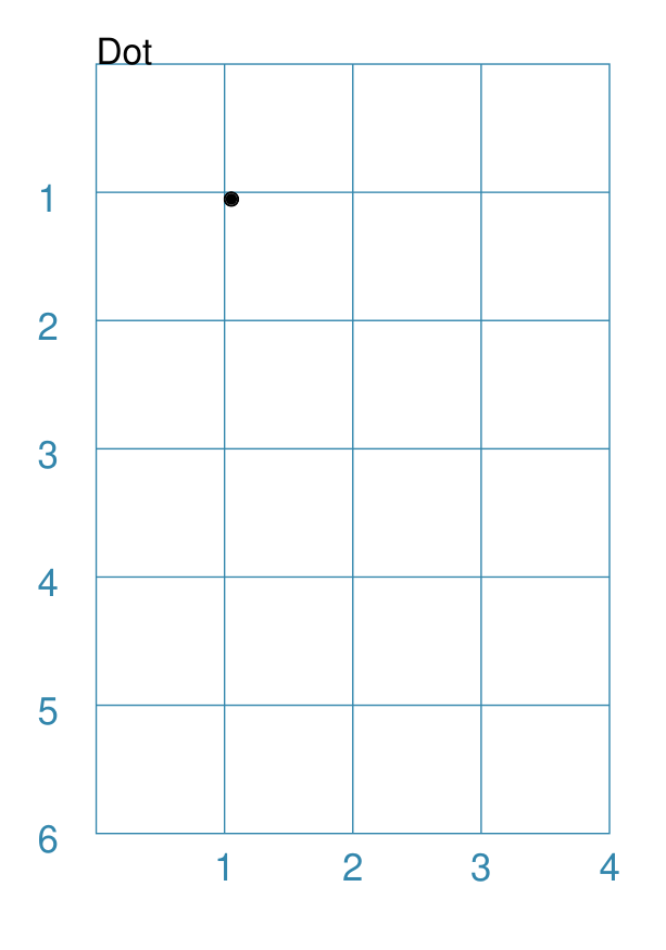
Dot
A Dot shape is essentially a very small, pre-filled Circle.
Example 1. Default Dot
|
This example shows the shape constructed using the command with only defaults: Dot()
It has the following properties based on the defaults:
The default diameter for a Dot can be changed by setting its dot_width which, like stroke_width for Text, is in point units. |
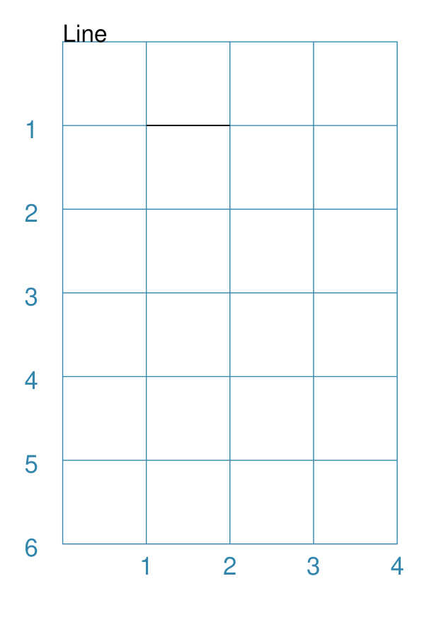
Line
Note
There is more detail about the many properties that can be defined for a Line in the customised Line section.
Example 1. Default Line
|
This example shows the shape constructed using the command with only defaults: Line()
It has the following properties based on the defaults:
Note that direction means “anti-clockwise from 0°”, where the zero lines runs in the “east” direction from the left. |
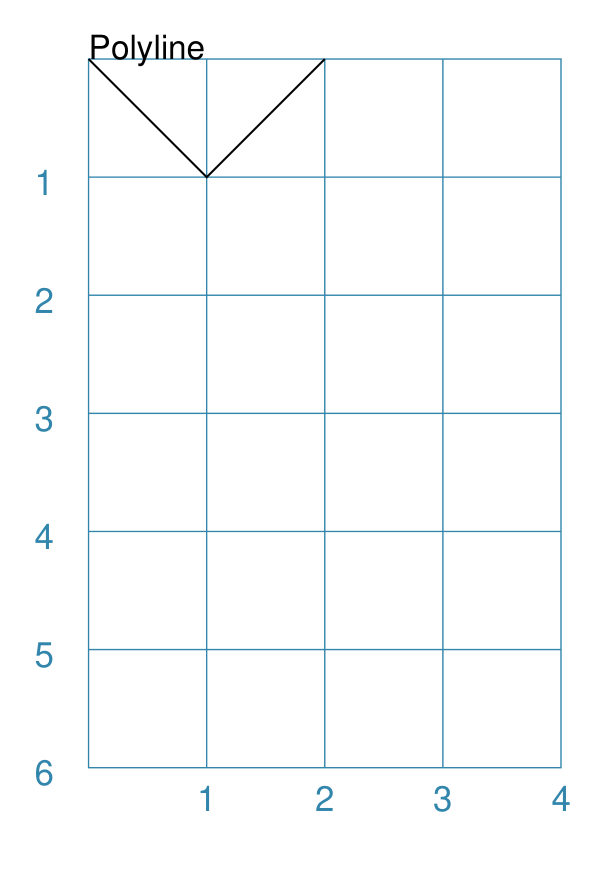
Polyline
A Polyline is a series of one or more lines joining two or more points.
In addition to setting points directly, the Polyline can be constructed using the steps property. This define a series of values that represent the x- and y-values relative to the last point drawn.
A Polyline can also be constructed using the snail property. This defines a series of relative distances, plus optional rotational and/or facing directions, that allow a sequence of lines and curves to be drawn.
The following examples illustrate these properties:
Example 1. Basic Polyline
|
The shape cannot be constructed using only default properties: Polyline()
Nothing will be visible; instead you will see a warning: WARNING:: There are no points to draw the Polyline
The upper example then shows the shape constructed using the command with these properties: Polyline(points=[(0, 0), (1, 1), (2, 0)])
It has the following properties based on these values:
The points for a Polyline are in a list, as shown by the square
brackets from
|
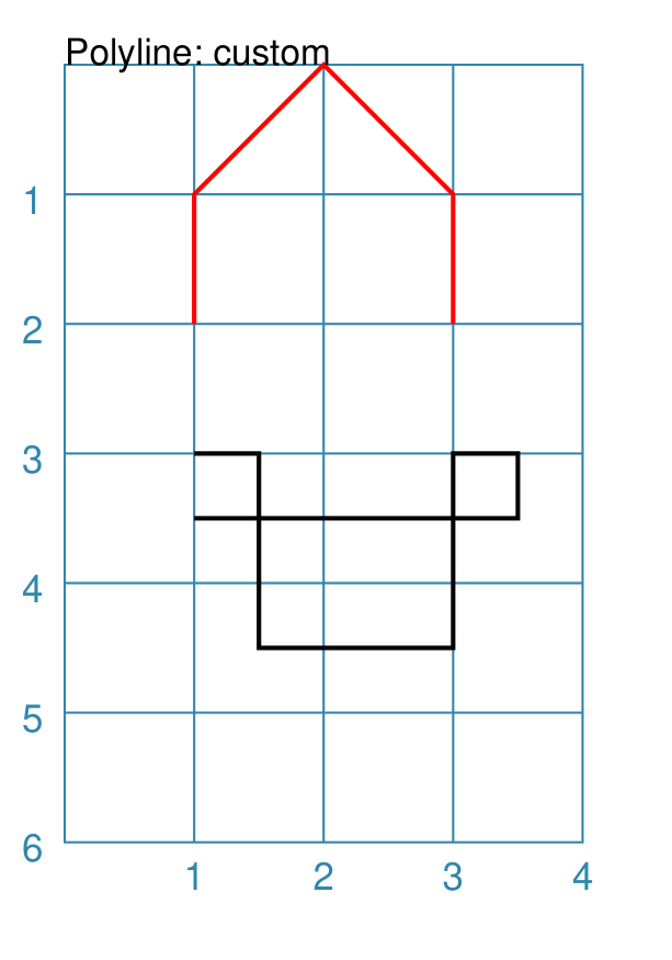
Example 2. Customised Polyline
|
The upper example shows the shape constructed using the command with these properties: Polyline(
points=[(1, 2), (1, 1), (2, 0), (3, 1), (3, 2)],
stroke_width=1, stroke="red")
Here the points are arranged so as to create a basic ‘house’ outline. The lower example also shows how to create a Polyline using the command with these properties: Polyline(
x=1, y=3, stroke_width=1,
steps='0.5,0 0,1.5 1.5,0 0,-1.5 0.5,0 0,0.5 -2.5,0')
Here, the steps property results in the drawing of an outline using a series of distances — or offsets — from the last point. The start is provided by the x and y values. Each pair of comma-separated values are x- and y-distances respectively. |
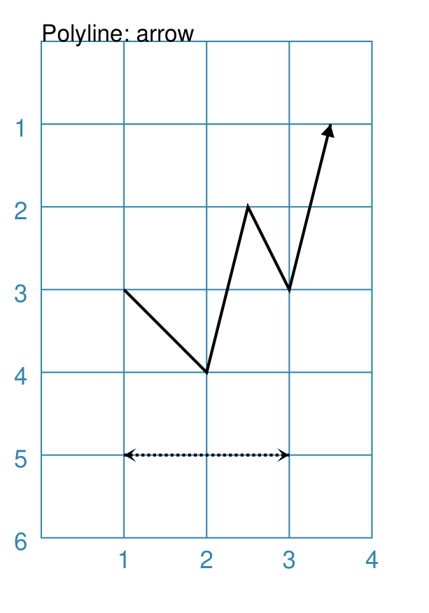
Example 3. Polyline with Arrow
|
The shape is constructed with these properties: Polyline(
points=[(1,3), (2,4), (2.5,2), (3,3), (3.5,1)],
stroke_width=1,
arrow=True
)
Polyline(
points=[(1,5), (3,5)],
stroke_width=1,
dotted=True,
arrow_style='notch',
arrow_double=True
)
This example makes use of the “arrow” properties available for a line. For more details on how arrows are used and set, see the Line with Arrow example. |
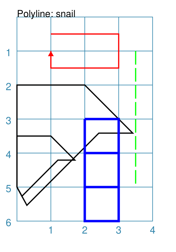
Example 4. Polyline with Snail
The snail property is loosely based on the concept and approach of the Turtle graphics drawing module available for Python (see: https://docs.python.org/3/library/turtle.html).
Instead of using points, the idea of the snail is to create a Polyline based on a series of lines of given length, where the line direction — or orientation — will already have been set. Each line is then drawn starting from the end point of the previous line.
A snail property consists of a series of terms, each separated by a space. Each term either relates to a direction change or to drawing a line of a certain length
Directions can be set as follows:
a compass direction: one of n, e, w, s, ne, se, sw, or nw
an absolute angle: an
afollowed by a value in degrees, from 0 to 360, measured counter-clockwise from the east directiona relative angle:
a
ror-sign (followed by a value in degrees): will decrease the current angle i.e. alter it in a clockwise directiona
lor+sign (followed by a value in degrees): will increase the current angle i.e. alter it in an anti-clockwise direction
Creating a line is done as follows:
a normal value — whole or fractional — will draw a line that distance, in the last direction that was set
using a pair of asterixes (
**) ` will draw a line from the current point back to the start
Moving - without creating a line - is done as follows:
a relative move: a
jfollowed by a value which is the distance, at which the new point will be set — according to the last direction that was set; no line will be drawn between the pointsa fixed point move: a single asterix (
*) will set the next, new point to match the one at the start; no line will be drawn between the points
Note
The snail line always starts at the x- and y-point defined for the Polyline; and the starting direction is “e” or 0°. The first term in the snail property can either be a direction or a distance.
|
The Polyline shape is constructed with these properties: snail_line = "n 3 e 2 -45 2 w 1 sw 3 **"
Polyline(
y=0.5,
snail="2 s 1 w 2 n 1",
stroke_width=1,
stroke="red",
arrow=True)
Polyline(
x=0, y=5,
snail=snail_line,
stroke_width=1)
Polyline(
x=0, y=5,
snail=snail_line,
stroke_width=1,
scaling=0.5)
Polyline(
x=3.5, y=1,
snail="s 0.4 j0.1 "*8,
stroke_width=1,
stroke="green")
Polyline(
y=3, x=2,
snail="e 1 s 1 w 1 n 1 s j1 "*3,
stroke_width=2,
stroke="blue")
The top example is a simple red line going in a square. It starts by
going east — the default direction — for The two examples with the black lines share the same snail line,
assigned to The example with the green line shows how a dotted line can be
constructed using the “jump” ( The example with the blue line shows how a shape — in this case a
square — is constructed multiple times using the *3` to
repeat the outline three times. Again, the “jump” ( |
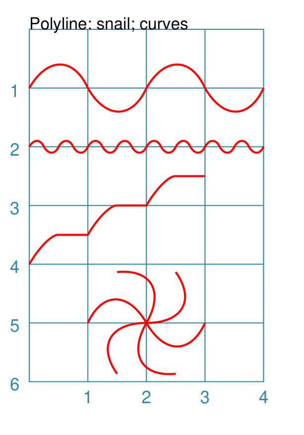
Example 5. Polyline with Snail Curves
In addition to all the options for snail as described in Example 4. Polyline with Snail, there is also the option to draw curves as part of the line.
A curve is specified by a series of three values, enclosed in round brackets;
for example (1.118 60 1). These values are as follows:
the first value is the distance to the curve’s inflection point;
the second value is the angle to the curve’s inflection point;
the third value is the distance to the curve’s end-point.
So, the curve is drawn from the current point on the line, to a second point whose location is determined by a combination of the distance — specified by the third value — and the “current” direction, determined at the time just before the curve is drawn. The curve will then bend, based on the location of the inflection point — note that the curve does not go to that inflection point, but is rather “pulled” towards it to form the bend.
|
The Polyline shape is constructed with these properties: Polyline(
y=1, x=0,
snail="(1.118 60 1) (1.118 -60 1) "*2,
stroke_width=1,
stroke="red")
Polyline(
y=2, x=0,
snail="(1.118 60 1) (1.118 -60 1) "*8,
scaling=0.25,
stroke_width=1,
stroke="red")
Polyline(
y=4, x=0,
snail="a45 (0.6 60 0.707) e 0.5 "*3,
stroke_width=1,
stroke="red")
Polyline(
y=5, x=2,
snail="r60 (1.118 r60 1) * "*6,
stroke_width=1,
stroke="red")
All these examples show repetion in effect; the same basic set of lines repeated multiple times. Again, note that a space is needed at the end of the snail’s text string in order to support this repeat. The first three examples use absolute angles for the curve — whether positive or negative — but the last example uses a relative angle, so that the curve, starting each time from the home location, changes its orientation because the “current direction” is constantly increasing. |
Text
It may seem strange to view text as a “shape” but, from a drawing point of view, it’s really just a series of complex lines drawn in a particular pattern! Thus text has a position in common with many other shapes, along with stroke to set its line color, as well as its own special properties.
The basic properties that can be set are:
text - the text string to be displayed
font_size - default is
12pointsfont_name - the default is
Helveticastroke - the default text color is
blackalign - the default alignment is
centre; it can be changed to beleftorright
Note
There is more detail about the various properties that can be defined for Text in the customised text doc.
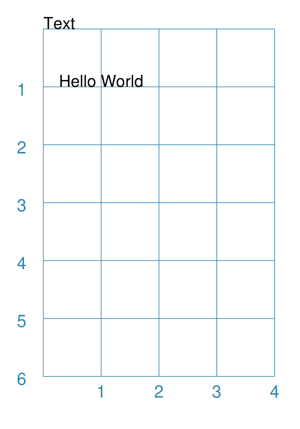
Example 1. Default Text
|
This example shows the shape constructed using the command with mostly defaults. Only the text property is changed from a blank string — otherwise there would nothing to see! Text(text="Hello World")
It otherwise has the following properties based on the defaults:
|
Enclosed Shapes
These shapes are created by enclosing an area, the most basic being a simple rectangle. They effectively have two dimensions: height and width.
The difference between enclosed and linear shapes is that the area enclosed by the shape can be filled with a color. The default fill color is white. There is an overview on how color is used in the Basic Concepts section
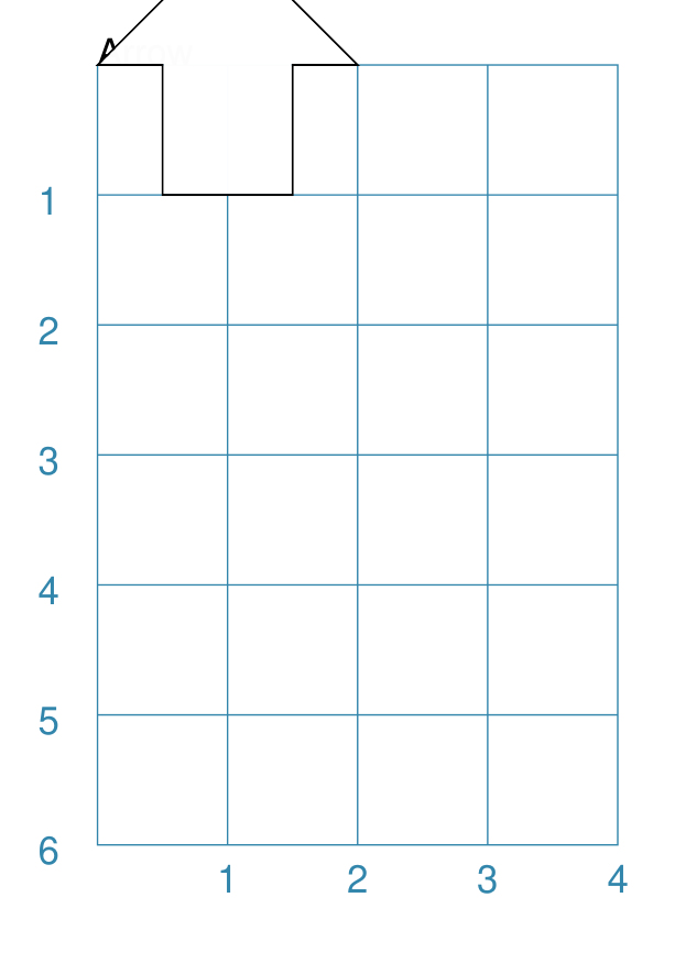
Arrow
An Arrow consists of two main parts: the tail (or body) and the head. In terms of protograf conventions, the tail is the part that takes on the common properties of height and width; while the dimensions for the head, if not provided, are calculated from those.
Example 1. Default Arrow
|
This example shows the shape constructed using the command with only defaults: Arrow()
It has the following properties based on the defaults:
|
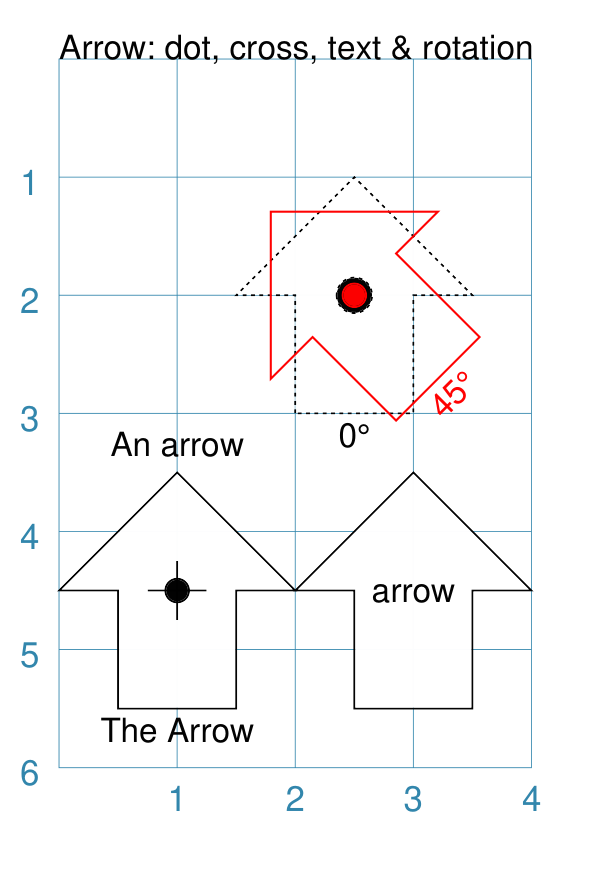
Example 2. Rotated Arrow
|
This example shows the shape constructed using the commands as follows: Arrow(
x=1, y=5.5,
title="The Arrow", heading="An arrow",
dot=0.1, cross=0.5)
Arrow(
x=2.5, y=3, title="0\u00B0",
dot=0.15, dotted=True)
Arrow(
x=2.5, y=3, title="45\u00B0",
dot=0.1, dot_stroke="red",
fill=None, stroke="red", rotation=45)
Arrow(
x=3, y=5.5,
label="arrow")
The shapes all set the following properties:
The lower-left Arrow also sets the following properties:
The lower-right Arrow also sets the following properties:
The two arrows in the top-right are superimposed. The red outline Arrow shares the same centre as the black dotted Arrow before/below it. The red arrow is rotated 45° to the left about the centre. Note The degrees sign is a Unicode character i.e. a “\u” followed by four numbers and/or letters. For access to full Unicode lists as well as the option to search for characters by name, see: https://www.compart.com/en/unicode/plane/U+0000 |
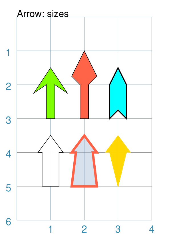
Example 3. Styled Arrow
|
This example shows the shape constructed using the commands as follows: Arrow(
x=1, y=5, height=1, width=0.5,
head_height=0.5, head_width=0.75)
Arrow(
x=2, y=5, height=1, width=0.5,
head_height=0.5, head_width=0.75,
tail_width=0.75,
stroke="tomato", fill="lightsteelblue",
stroke_width=2, transparency=50)
Arrow(
x=3, y=5, height=1, width=0.5,
head_height=0.5, head_width=0.75,
tail_width=0.01,
fill_stroke="gold")
Arrow(
x=1, y=3, height=1, width=0.25,
head_height=0.5, head_width=1,
points_offset=-0.25,
fill="chartreuse")
Arrow(
x=2, y=3, height=1, width=0.25,
head_height=1, head_width=0.75,
points_offset=0.25,
fill="tomato")
Arrow(
x=3, y=3, height=1, width=0.5,
head_height=0.5, head_width=0.5,
tail_notch=0.25,
stroke="black", fill="cyan", stroke_width=1)
The shapes all set the following properties:
The head_width represents the maximum distance between the outer arrowhead “wingtips”. The silver arrow has these properties:
The smaller tail_width means the base of the arrow is wider than the body i.e. the width at the top of the tail section. The gold arrow has these properties:
The near-zero tail_width means the base of the arrow is nearly shown as a point. The green (
The points_offset here means that the two “wingtips” of the arrowhead are moved back towards the tail. The red (
The points_offset here means that the two “wingtips” of the arrowhead are moved forwards away from the tail. In this case, the head has been been made narrower and longer. The blue (
The blue arrow also has matching width and head_width (of |
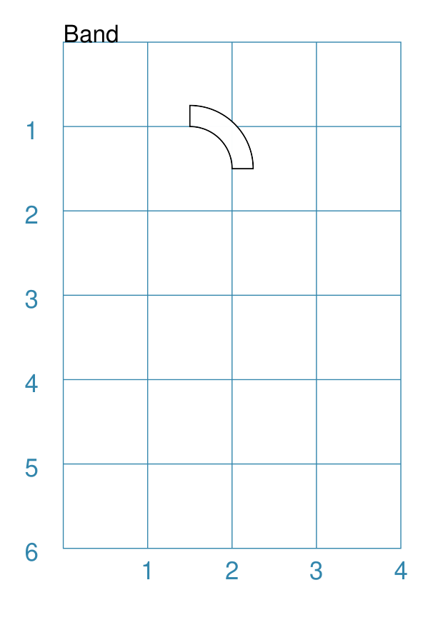
Band
A Band is a curved area between two radii; effectively it is a “subset” or “slice” of a Sector. More formally it is known as an Annular Sector or Annular Section.
A Band is drawn with a height (its “thickness”), a radius, as well as a centre point from which the radii extend. There is a starting angle, which determines where one radius, forming the end line, is drawn, and a “sweep” angle — the angle_width property — which determines where the second radius, forming the other end line, is drawn. Together, these properties define where and how wide a Band extends.
Note
The maximum extent of a Band is 180° — half a circle!
The Band does not support a defined rotation property, like many other shapes’; rather the rotation value is calculated based on the angle_start and the angle_width properties.
Example 1. Default Band
|
This example shows the shape constructed using the command with only one property set: Band(height=0.25)
It has the following properties:
Note that a Band cannot be drawn with only default values; this is
because its height — which defaults to |
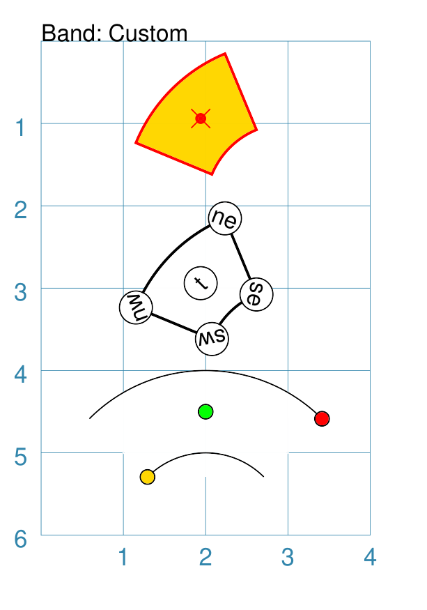
Example 2. Customised Band
|
This example shows the shape constructed using the command with these properties: Band(
cx=2, cy=4,
stroke_width=1,
stroke="red", fill="gold",
radius=1,
angle_start=112.5,
angle_width=45,
dot=0.05,
cross=0.33,
)
Band(
cx=3, cy=4,
stroke_width=1,
radius=1,
angle_start=112.5,
angle_width=45,
vertex_shapes=[
circle(radius=0.2, label="ne"),
circle(radius=0.2, label="se"),
circle(radius=0.2, label="sw"),
circle(radius=0.2, label="nw")
],
vertex_shapes_rotated=True,
centre_shapes=[
circle(radius=0.2, label="t")],
centre_shapes_rotated=True,
)
bnd = Band(
cx=2, cy=6,
radius=1,
angle_start=45,
angle_width=90,
no_ends=True,
)
Dot(
cxy=bnd.geo.ne,
fill="red",
dot_width=5)
Dot(
cxy=bnd.geo.sw,
fill="gold",
dot_width=5)
Dot(
cxy=bnd.geo.c,
fill="green",
dot_width=5)
The top Band sets the centre point around which it is drawn to be cx at 2 and cy of 4. The Band is styled with stroke, fill, amnd stroke_width. Its start angle is set at 112.5° (anti-clockwise from horizontal east) and the width of the angle is 45°. In addition, the Band has a cross and dot which are automatically drawn at the centre. The middle Band shows how shapes can be drawn at the vertices — clockwise, from north-east — and at the centre. For more detail on drawing such shapes, including the ability to rotate them, see Shapes Common Properties. The lower Band has similar configuration to the middle Band, but it also
has the property no_ends set to As an example of accessing the Band’s geometry, colored Dots are shown located at two of the vertices, as well as at the centre of the Band. |
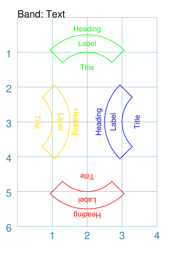
Example 3. Band with Text
|
This example shows the shape constructed using the command with these properties: bnd = Common(
radius=1, height=0.5,
angle_width=90,
stroke_width=0.5,
fill=None,
label_size=6,
title_size=6,
heading_size=6,
heading="Heading",
label="Label",
title="Title",
)
Band(
cx=2, cy=2,
stroke="green",
angle_start=45,
common=bnd,
)
Band(
cx=4, cy=3,
stroke="blue",
angle_start=135,
common=bnd,
)
Band(
cx=0, cy=3,
stroke="gold",
angle_start=315,
common=bnd,
)
Band(
cx=2, cy=4,
stroke="red",
angle_start=225,
common=bnd,
)
These four Bands share a number of common properties, in terms of their
angle_width of The different angle_start values show how the text is effectively “rotated” relative to the centre of each Band. A Band does not have a defined rotation property, like many other shapes, but rather the rotation value is calculated based on the angle_start and the angle_width properties. |
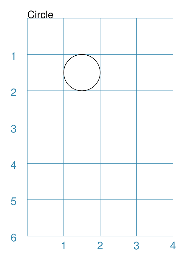
Circle
Note
There is more detail about the many properties that can be defined for a Circle in the customised Circles section.
Example 1. Default Circle
|
This example shows the shape constructed using the command with only defaults: Circle()
It has the following properties based on the defaults:
|
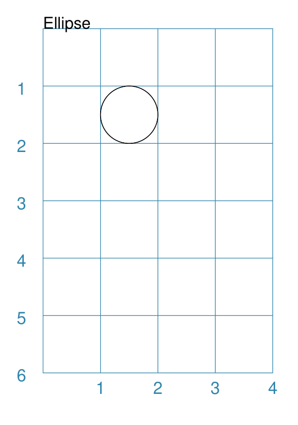
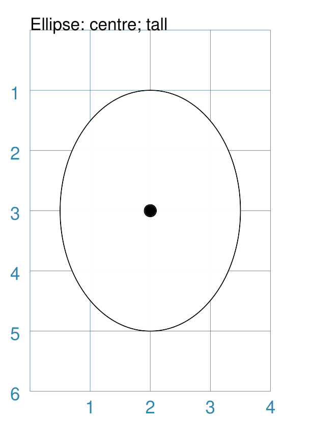
Ellipse
Example 1. Default Ellipse
|
This example shows the shape constructed using the command with only defaults: Ellipse()
It has the following properties based on the defaults:
Because the height and width default to the same value, it appears as a Circle. |
Example 2. Customised Ellipse
|
This example shows the shape constructed using the command with these properties: Ellipse(cx=2, cy=3, width=3, height=4, dot=0.1)
It has the following properties set for it:
Because the height is greater than the width it has more of an egg-shape. |
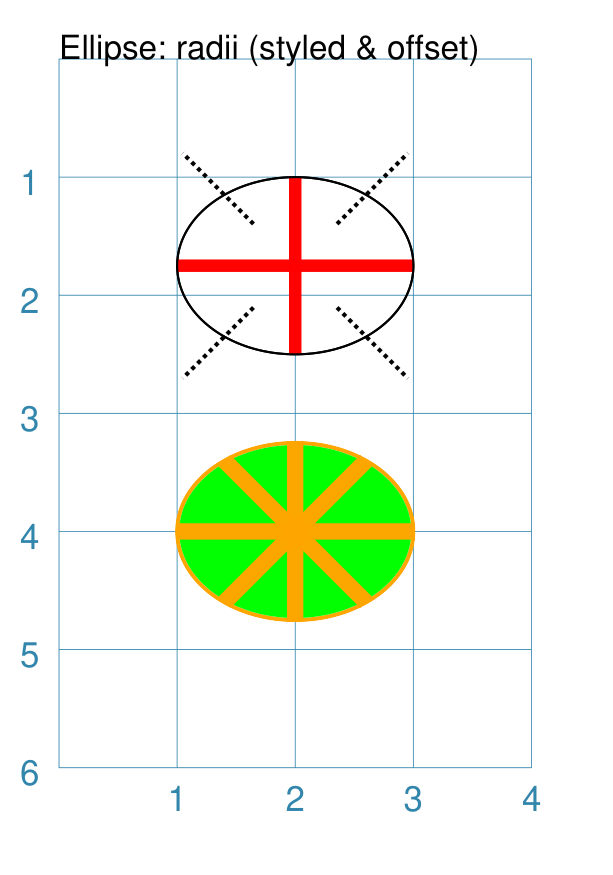
Example 3. Ellipse Radii
Radii are like spokes of a bicycle wheel; they are drawn from the centre of an Ellipse towards its circumference.
|
This example shows the shape constructed using the command with these properties: Ellipse(
x=1, y=1,
width=2, height=1.5,
fill=None,
radii="n, s, e, w",
radii_stroke_width=3,
radii_stroke="red")
Ellipse(
x=1, y=1,
width=2, height=1.5,
fill=None,
radii=[45,135,225,315],
radii_stroke_width=1,
radii_dotted=True,
radii_offset=0.5,
radii_length=1)
Ellipse(
cx=2, cy=4,
width=2, height=1.5,
fill="green",
stroke="orange",
stroke_width=1,
radii=[0,90,180,270,45,135,225,315],
radii_stroke_width=4,
radii_stroke="orange")
The top two Ellipses are drawn at the same location with the same
basic properties; with their fill set to These Ellipses also have some of the following properties, which demonstrate how radii can be set and customised:
|
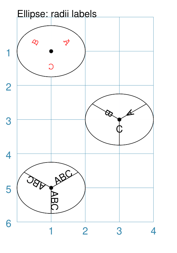
Example 4. Ellipse Radii - Labels
|
This example shows the shape constructed using the command with these properties: Ellipse(
cx=1, cy=1,
width=2, height=1.5,
radii=[30, 150, 270],
radii_stroke="white",
radii_labels=["A", "B", "C"],
radii_labels_rotation=270,
radii_labels_stroke="red",
radii_labels_font="Courier",
dot=0.05)
Ellipse(
cx=3, cy=3,
width=2, height=1.5,
radii=[30, 150, 270],
radii_labels="A,B,C",
radii_labels_rotation=90,
dot=0.05)
Ellipse(
cx=1, cy=5,
width=2, height=1.5,
radii=[30, 150, 270],
radii_labels="ABC",
dot=0.05)
Apart from the radii lines themselves, the labels’ properties can be set:
The top-most example shows how text strings are created with a list. The middle example shows how the text string is split using commas; this results in a list whose members are used to create the labels. The lower-most example shows how the same text is repeated for all radii. The top example also shows how text is rotated and styled. The radii lines’ stroke color is set to match the circle fill, thereby making it “invisible”. The label rotation is relative to its upright position on the line; so 90° turns the text to the left and onto its “side”, as shown in the middle example. |
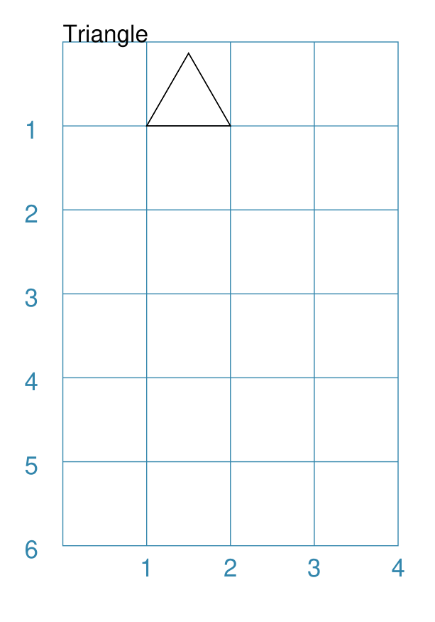
Triangle
A Triangle is a three-sided polygon. It can have uniform sides, in which case it is an equilateral triangle — the default; two matching sides, in which case it is an isosceles triangle; or all sides unequal, in which case it is an irregular triangle.
Note
There is more detail about the various properties that can be defined for a Triangle in the customised shapes’ Triangle section.
Example 1. Default Triangle
|
This example shows the shape constructed using the command with only defaults: Triangle()
It has the following properties based on the defaults:
|
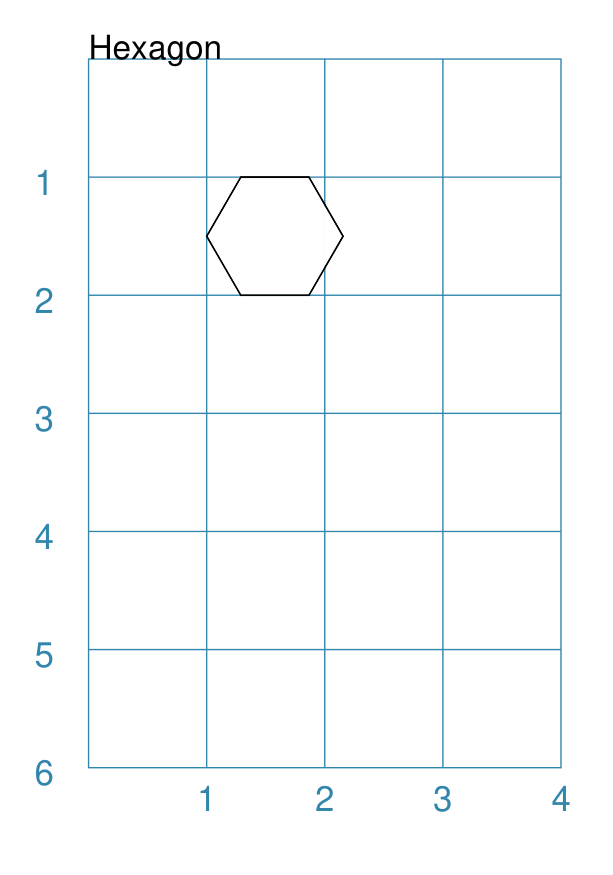
Hexagon
Note
There is more detail about the many properties that can be defined for a Hexagon in the customised shapes’ Hexagon section.
Example 1. Default Hexagon
|
This example shows the shape constructed using the command with only defaults: Hexagon()
It has the following properties based on the defaults:
|
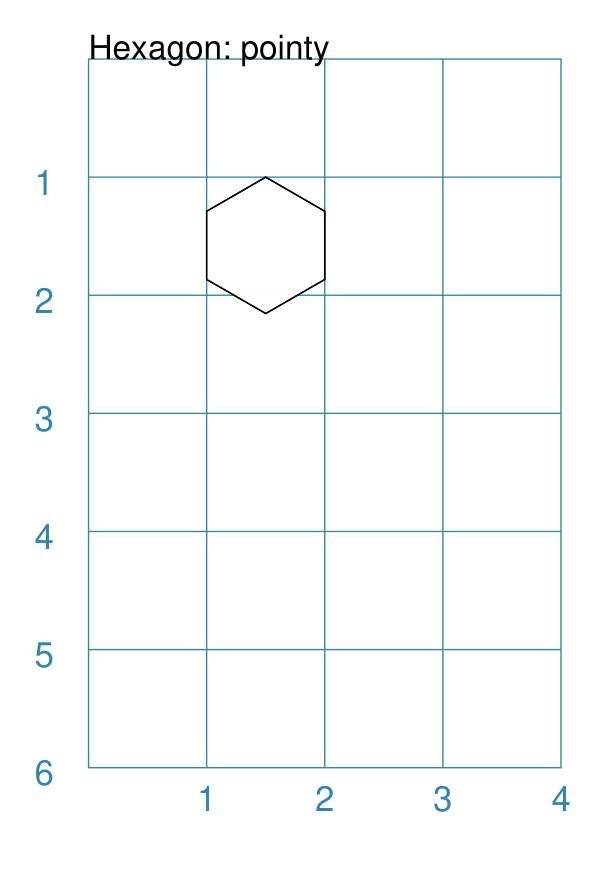
Example 2. Pointy Hexagon
|
This example shows the shape constructed using the command with only one change to the defaults: Hexagon(orientation="pointy")
It has the following properties based on the defaults:
|
Pod
A pod is a symmetrical shape constructed from two matching curved lines, each drawn on either side of a straight centre line.
The shape of each curve is controlled by setting d prefixed values for two pairs of control points. If only the first control point is set, then a simple curve is created; but if both control points are set, then a Bezier line is constructed.
Hint
It is not always obvious how exactly to construct a Bezier curve, so some experimentation may be needed to get the desired result!
Pod Properties
Apart from the common drawing properties shared with other shapes, a Pod
has these available:
length - the length of the centre line; by default this is
1centre_line - if set to
Truethen the centre line will be displayeddx1 and dy1 - respectively the horizontal and vertical distance away from the start of the centre line for the first control point i.e. these are relative distances and not absolute points. By default, they are set to be equal to half the length of the centre line.
dx2 and dy2 - respectively the horizontal and vertical distance away from the start of the centre line for the second control point i.e. these are relative distances and not absolute point values. By default, they are not set to any value.
The following examples shows different ways how a Pod can be constructed.
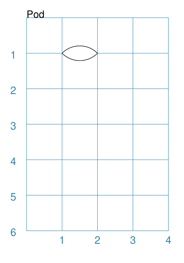
Example 1. Default Pod
|
This example shows the shape constructed using the command with only defaults: Pod()
It has the following properties based on the defaults:
|
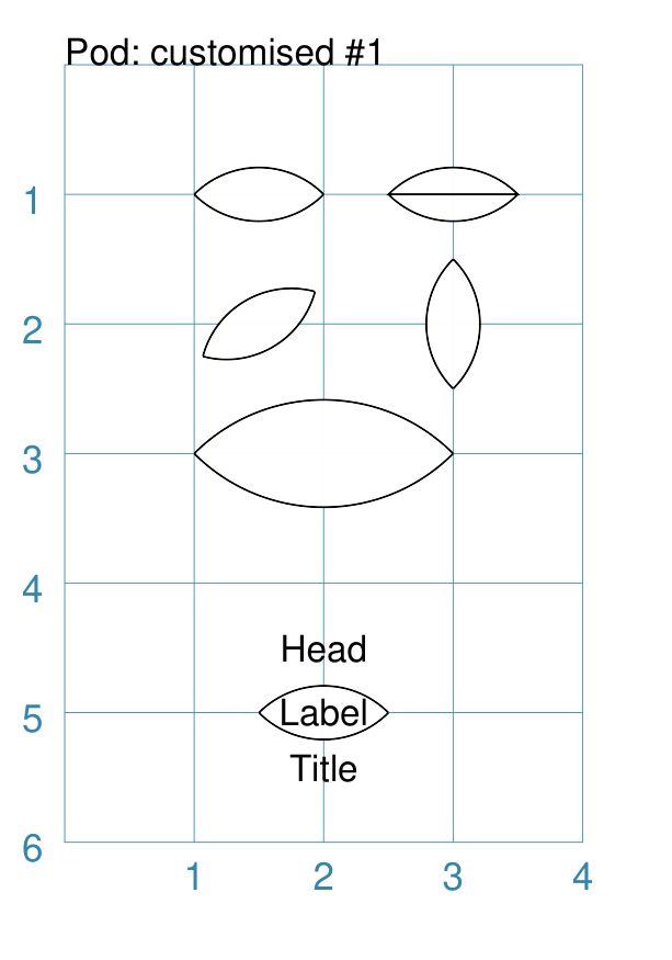
Example 2. Customised Pod
|
This example shows pod shapes constructed using the command with the following properties: Pod()
Pod(cx=3, cy=1,
center_line=True)
Pod(x=1, y=2, rotation=30)
Pod(cx=3, cy=2, rotation=90)
Pod(cx=2, cy=3,
length=2)
Pod(cx=2, cy=5,
heading="Head",
title="Title",
label="Label")
The top-left shape is the default. The top-right shows how using the centre_line property enables a line to be drawn from one end of the Pod to the other. The smaller middle-left and middle-right shapes show how the Pod can be rotated counter-clockwise around its centre — note that centre is calculated the same way regardless of whether the Pod is drawn using x and y or cx and cy. The large middle shape shows setting the shape’s length, and how the default size of the curved lines is increased proportionally to it. The lower shape shows how the heading, label and title are set — see Text Descriptions for more details. |
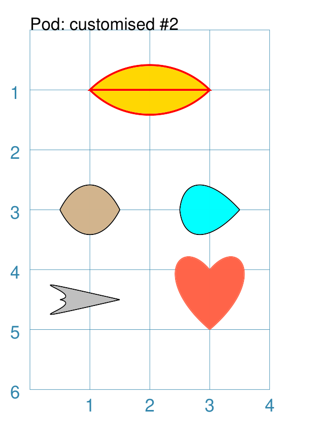
Example 3. Customised Pods
|
This example shows pod shapes constructed using the command with the following properties: Pod(cx=2, cy=1,
length=2,
center_line=True,
fill="gold",
stroke="red",
stroke_width=1)
Pod(cx=1, cy=3,
dy1=1,
fill="tan")
Pod(cx=3, cy=3,
dy1=1, dx1=0.1,
fill="aqua")
Pod(cx=1, cy=4.5,
dy1=0.1,
dy2=0.5, dx2=-1.2,
fill="silver")
Pod(cx=3, cy=4.5,
dx1=-0.6, dy1=-0.5,
dx2=0.15, dy2=-1,
fill_stroke="tomato",
rotation=-90)
The top example shows setting of colors and line length for a longer, thicker pod. The middle-left example, drawn with a brown fill color, shows how the Pod curve size can be changed by setting the dy1 property. The middle-right example, drawn with a blue fill color, shows how the Pod curve size can be changed by setting the dy1 and dx1 properties. The lower-left example, drawn with a grey fill color, shows how the Pod’s Bezier curves can be set using the dy2 and dx2 properties. The lower-right example shows how the Pod Bezier curve can be set using the dy2 and dx2 properties as well as dy1 and dx1 properties in order to create a more recognisable “heart” shape. |
Polygon
A polygon is a regular shape constructed of three or more sides of equal length, and whose interior angles are all equal.
For example, a hexagon is simply a polygon with 6 sides and an octagon is a polygon with 8 sides.
HINT Unlike the Hexagon shape, a Polygon can be rotated!
The following examples show how a Polygon can be constructed.
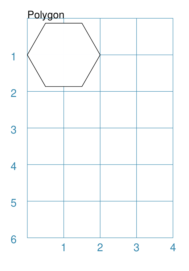
Example 1. Default Polygon
|
This example shows the shape constructed using the command with only defaults: Polygon()
It has the following properties based on the defaults:
|
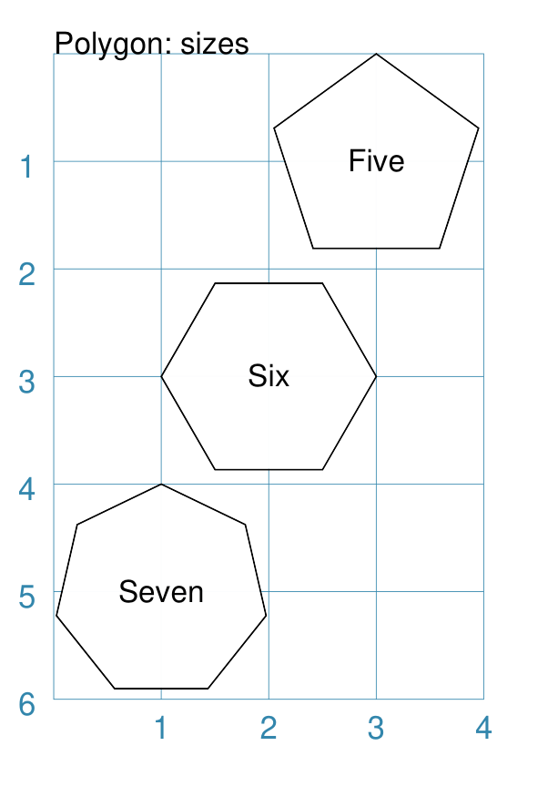
Example 2. Polygon with Sides
|
This example shows three shapes constructed using the command with the following properties: Polygon(
cx=1, cy=5, sides=7,
radius=1, label="Seven")
Polygon(
cx=2, cy=3, sides=6,
radius=1, label="Six")
Polygon(
cx=3, cy=1, sides=5,
radius=1, label="Five")
It can be seen that each shape is constructed as follows:
Even-sided polygons have a “flat” top, whereas odd-sided ones are asymmetrical; this can be adjusted through rotation. |
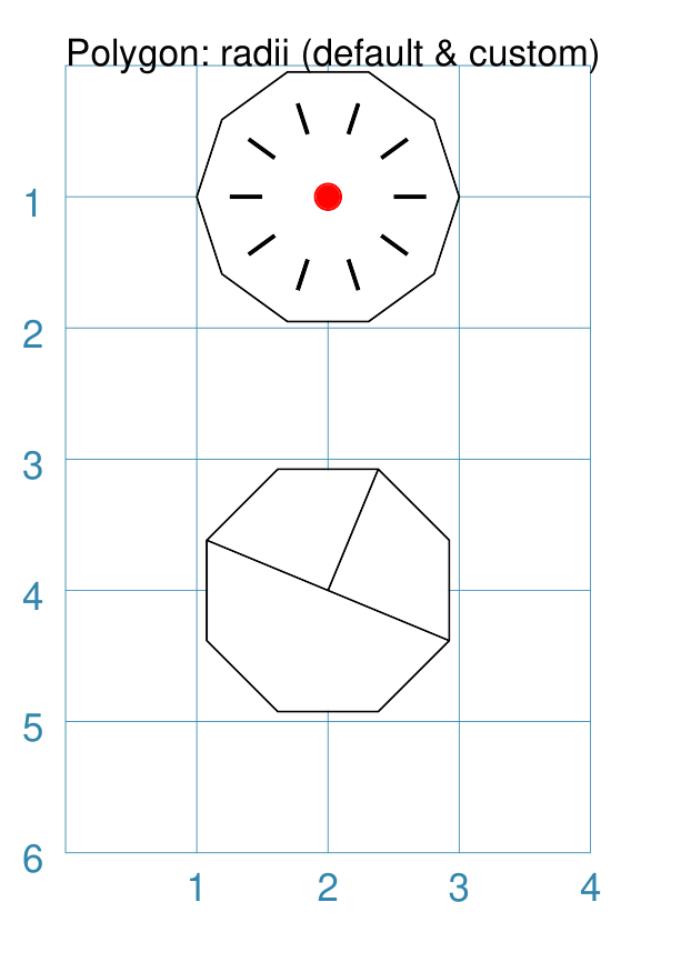
Example 3. Polygon with Radii
|
This example shows the shape constructed using the command with the additional properties. The lower example: Polygon(
cx=2, cy=4, sides=8, radius=1,
radii="1,3,7")
It has the following properties:
The top example: Polygon(
cx=2, cy=1, sides=10, radius=1,
radii="*",
radii_offset=0.75,
radii_length=0.25,
radii_stroke_width=1,
dot=0.1, dot_stroke="red"
)
It has the following properties:
Note When the radii length is shorter than the distance from vertex to centre, the line will still go in the same direction but never touch the vertex. |
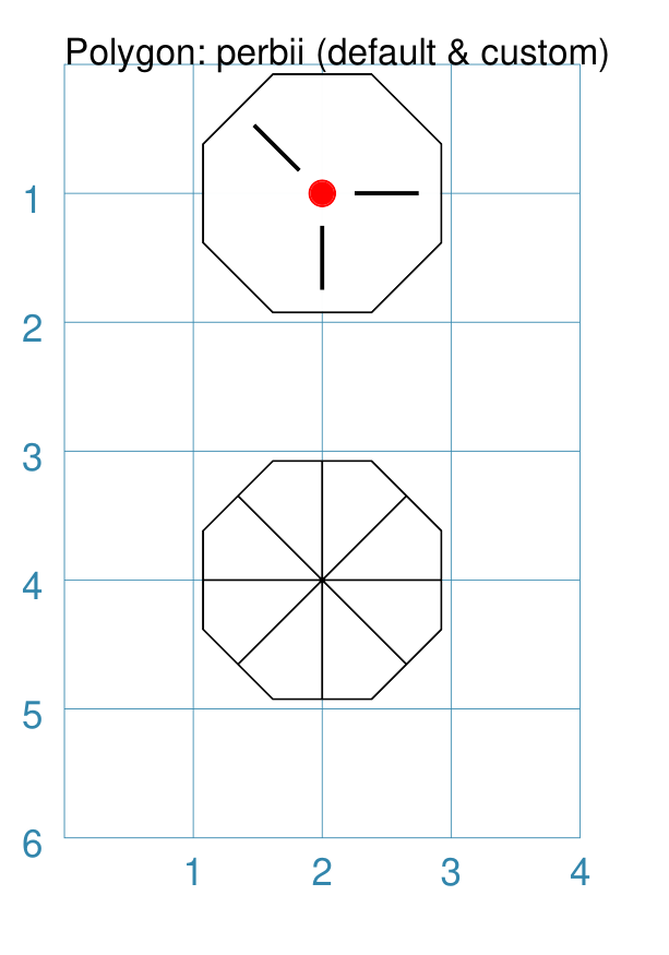
Example 4. Polygon with Perbii
The perbii — “perbis” is short for “perpendicular bisector” and “perbii” is the plural form — defines lines that should be drawn from the centres of the sides of the polygon to the polygon’s centre.
|
This example shows the shape constructed using the command with the additional properties. The lower example: Polygon(
cx=2, cy=4, sides=8,
radius=1, perbii='*')
It has the following properties:
The top example: Polygon(
cx=2, cy=1, sides=8, radius=1,
perbii="2,4,7",
perbii_offset=0.25,
perbii_length=0.5,
perbii_stroke_width=1,
dot=0.1, dot_stroke="red")
It has the following properties:
The edges of the polygon are numbered; the east-most facing edge is 1, and then numbers increase in an clockwise direction. Its properties can be set as follows:
Note that when the perbii length is shorter than that the distance from centre point to edge, the line will still go in the same direction but never touch the vertex or the edge. |
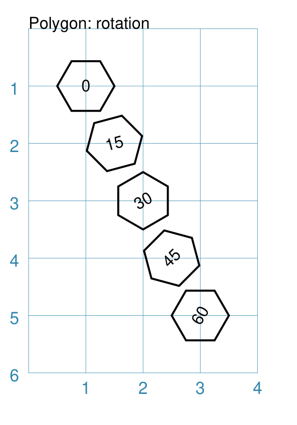
Example 5. Polygon Rotation
|
This example shows five Polygons constructed using the command with additional properties. Note the use of the Common command to allow multiple Polygons to share the same properties. poly6 = Common(
fill=None,
sides=6,
diameter=1,
stroke_width=1)
Polygon(
common=poly6,
cy=1, cx=1.0, label="0")
Polygon(
common=poly6,
cy=2, cx=1.5,
rotation=15, label="15")
Polygon(
common=poly6,
cy=3, cx=2.0,
rotation=30, label="30")
Polygon(
common=poly6,
cy=4, cx=2.5,
rotation=45, label="45")
Polygon(
common=poly6,
cy=5, cx=3.0,
rotation=60, label="60")
The examples have the following properties:
The rotation defined here is anti-clockwise from the horizontal. |
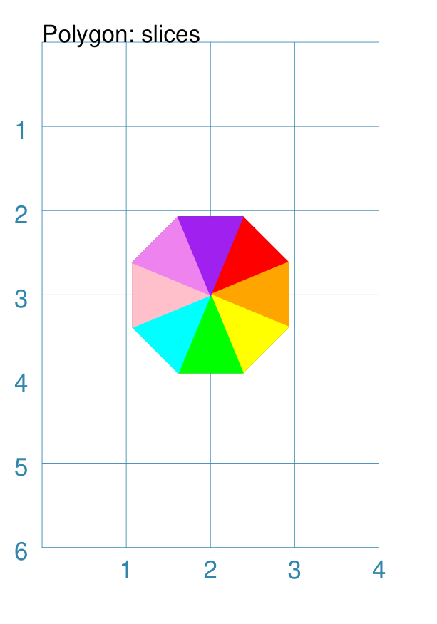
Example 6. Polygon Slices
Slices are a set of colors that are drawn as triangles inside a a Polygon in a clockwise direction starting from the one that is at, or approximates, “North East”.
If there are fewer colors than all the possible triangles, then the colors are repeated, starting from the first one.
|
This example shows a Polygon constructed using these commands: Polygon(
cx=2, cy=1, sides=8, radius=1,
slices=['red', 'orange', 'yellow', 'green',
'aqua', 'pink', 'violet', 'purple'])
This example has the following properties:
|
Polyshape
A Polyshape is an irregular polygon, constructed using a series of points.
It’s basic setup and construction shares much in common with the Polyline but with some differences, such as its fill and centre properties.
The following examples illustrate these properties:
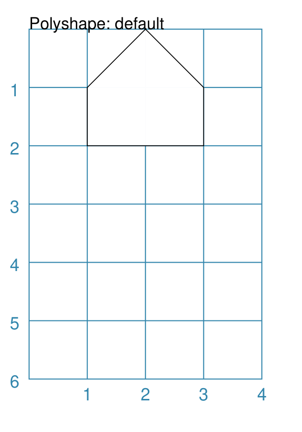
Example 1. Default Polyshape
|
If the shape is constructed using the command with only defaults: Polyshape()
Then nothing will be visible; instead you will see a warning: WARNING:: There are no points to draw the Polyshape
Like Polyline, the Polyshape requires a list of points to be constructed. This example shows how to do this using the command with these properties: Polyshape(
points=[
(1, 2),
(1, 1),
(2, 0),
(3, 1),
(3, 2)])
It has the following properties:
The points for a Polyshape which represent its vertices are given in a list:
Lines are drawn between each successive point in the list; including a line from the last to the first. The default stroke and fill apply to this example of a Polyshape. |
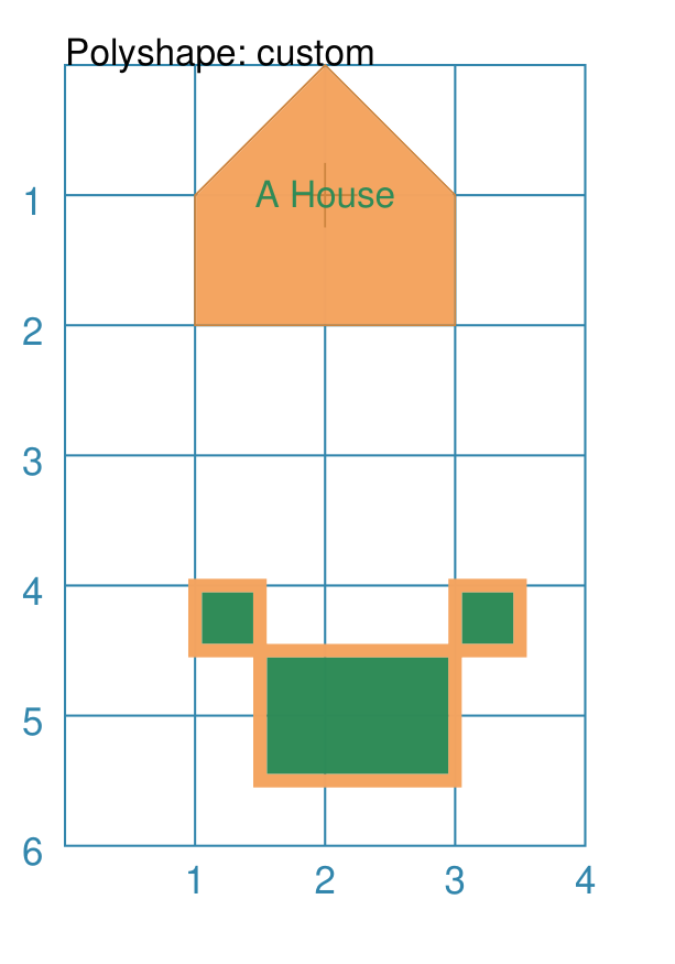
Example 2. Polyshape: Centre and Steps
While the Polyshape does not have the ability to be constructed using a cx and cy pair to set its centre location — like the symmetric shapes — it is possible to provide these values to the shape command, and they can then be used for a label, plus the dot and cross, similar to those other shapes.
NOTE - the program has no way of knowing or “checking” that the values for the cx and cy pair that you supply to it are correct!
In addition to setting points directly, the Polyshape can also be constructed using the steps property. This define a series of values that represent the relative distance from the last point drawn.
|
The shape is constructed using the command with these properties: Polyshape(
x=0, y=1,
points=[(1, 2), (1, 1), (2, 0), (3, 1), (3, 2)],
cx=2, cy=1,
label='A House',
label_stroke="seagreen",
cross=0.5,
fill="sandybrown",
stroke="peru",
)
As in Example 1, the points are used to construct the outline of the “house” shape. Other properties include:
Reminder: The lower shape shows how create a Polyshape using the command with these properties: Polyshape(
x=1, y=4,
steps='0.5,0 0,1.5 1.5,0 0,-1.5 0.5,0 0,0.5 -2.5,0 0,-0.5',
stroke="sandybrown",
stroke_width=3,
fill="seagreen")
Here, the steps property results in the drawing of an outline using a series of distances — or offsets — from the last point. The start is provided by the x and y values. Each pair of comma-separated values are x- and y-distances respectively. |
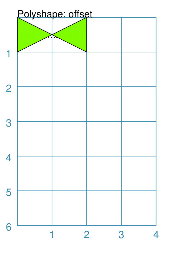
Example 3. Polyshape Offset
There are two other options available.
In addition to the cx and cy pair, an x and y pair can also be provided; these values will be used to offset (“move”) the Polyshape from the position it would normally occupy.
It is also possible to provide the points as a string of space-separated
pairs of comma-separated values; so instead of [(0,0), (1,1)] just use
"0,0 1,1".
|
The following Polyshapes are constructed using the command with these properties: Polyshape(
points="0,0 0,1 2,0 2,1 0,0",
cx=1, cy=0.5,
fill="gold",
label="Left ....... Right")
Polyshape(
x=1, y=2,
points="0,0 0,1 2,0 2,1 0,0",
fill="chartreuse",
label="Left ....... Right")
As in Example 2, the points property is used to construct the outline of the Polyshape. In this case, the points are set by a string of space-separated pairs of values. The fill color defines the color of the interior of the shapes. For the The points used to define the The |
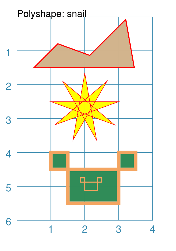
Example 4. Polyshape with Snail
The snail property is loosely based on the concept and approach of the Turtle graphics drawing module available for Python (see: https://docs.python.org/3/library/turtle.html).
Instead of using points, the idea of the snail is to create a Polyshape based on a series of lines of given length, where the line direction — or orientation — will already have been set. Each line is then drawn starting from the end point of the previous line.
A snail property consists of a series of terms, each separated by a space. Each term either relates to a direction change or to drawing a line of a certain length.
Directions can be set as follows:
a compass direction: one of n, e, w, s, ne, se, sw, or nw
an absolute angle: an
afollowed by a value in degrees, from 0 to 360, measured counter-clockwise from the east directiona relative angle:
a
ror-sign (followed by a value in degrees): will decrease the current angle i.e. alter it in a clockwise directiona
lor+sign (followed by a value in degrees): will increase the current angle i.e. alter it in an anti-clockwise direction
Creating a line is done as follows:
a normal value — whole or fractional — will draw a line that distance, in the last direction that was set
using a pair of asterixes (
**) will draw a line from the current point back to the start
Note
The snail line always starts at the x- and y-point defined for the Polyshape; and the starting direction is “e” or 0°. The first term in the snail property can either be a direction or a distance.
Unlike the Polyline snail, no “jump” type movement is allowed; there must be a continuous line.
|
The Polyshapes are constructed using the command with these properties: Polyshape(
x=0.5, y=1.5,
snail="ne 1 r65 1 ne 1.5 r125 1.44 **",
stroke_width=1,
#scaling=0.25,
stroke="red",
fill="tan")
Polyshape(
x=1, y=2.5,
snail="2 r160 "*9,
stroke_width=0.5,
#scaling=0.25,
stroke="red",
fill="yellow")
Polyshape(
x=1.5, y=4,
snail='w .5 s .5 e 2.5 n .5 w .5 s 1.5 w 1.5 n .5',
stroke="sandybrown",
stroke_width=3,
fill="seagreen")
Polyshape(
x=2, y=4.75,
snail='w .5 s .5 e 2.5 n .5 w .5 s 1.5 w 1.5 n .5',
scaling=0.25,
stroke="sandybrown",
stroke_width=1,
fill="seagreen")
The top example ilustrates the use of the The middle example — based on the one shown for the Turtle —
shows how a simple move-and-turn can be repeated multiple times (using
the The lower example is a repeat of the one shown for
Example 2. Polyshape: Centre and Steps but constructed with simple
compass directions. It may not be that much shorter, but it could be
clearer. In addition it can easily be scaled, as can be seen from the
small “inset” shape - the same snail but shrunk in size using
|
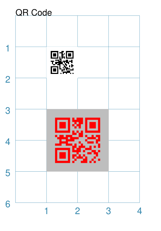
QRCode
A QR Code is a square image containing a pattern of black squares and dots. It represents encoded information that a device with a QR scanner, for example a cell phone, can decode.
The properties that can be provided to a QRCode command, apart from the
usual x and y, to set the upper-left corner, and height and width to
set the size, are:
image - this should be the first property and is the name of the file that will be created by the command
text - this contains the information that is to be encoded (and decoded)
scaling - the size of the indivdual QR Code squares, in pixels
stroke - the color of the pattern containing the black squares and dots
fill - the color that will appear as the background
Note
The QR Code images generated will be stored in the cache directory
.protograf/images/qrcodes (or .protograf\images\qrcodes);
see caching.
Example 1. Default QRCode
|
The shape cannot be constructed using only default properties: QRCode()
Nothing will be visible; instead you will see a warning: WARNING:: No text supplied for the QRCode shape!
This example shows the shape constructed using the commands with these properties: QRCode("qrcode1.png", text="Help")
The first command uses the defaults which means it has the following properties automtically set for it:
The second command overides various of these defaults: QRCode(
'qrcode2.png',
text="Help me ObiWan",
x=1, y=3,
height=2, width=2,
fill="gray",
stroke="red",
scaling=5
)
In this example, the QR Code is now larger with different colors. |
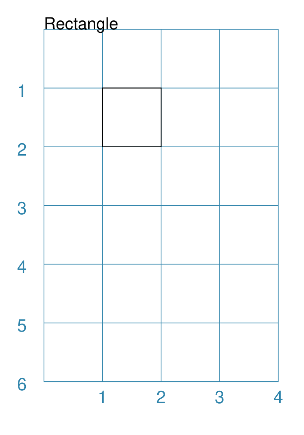
Rectangle
Note
There is more detail about the many properties that can be defined for a Rectangle in the customised Rectangle section.
Example 1. Default Rectangle
|
This example shows the shape constructed using the command with only defaults: Rectangle()
It has the following properties set for it:
Because all sides of the Rectangle are equal, it appears as though it is a Square. |
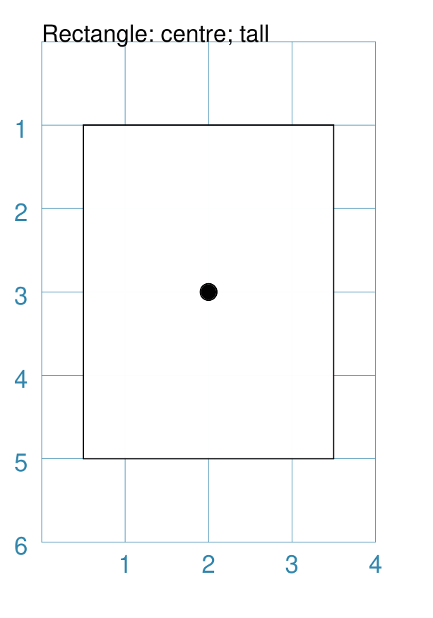
Example 2. Customised Rectangle
|
This example shows the shape constructed using the command with these properties: Rectangle(cx=2, cy=3, width=3, height=4, dot=0.1)
It has the following properties set for it:
Because the height is greater than the width the Rectangle has an appearance like a playing card. |
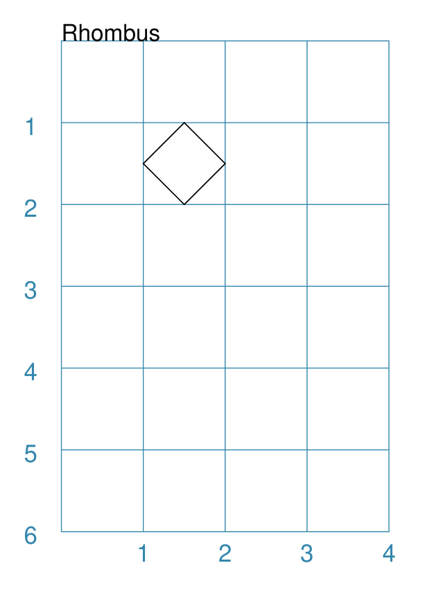
Rhombus
Example 1. Default Rhombus
|
This example shows the shape constructed using the command with only defaults: Rhombus()
It has the following properties based on the defaults:
Because the sides are of equal length, the Rhombus appears to be a rotated Square. |
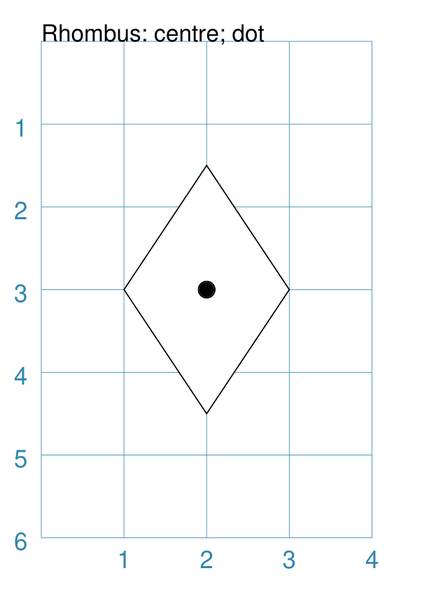
Example 2. Rhombus Centre & Dot
|
This example shows the shape constructed using the command with these properties: Rhombus(cx=2, cy=3, width=2, height=3, dot=0.1)
It has the following properties set for it:
|
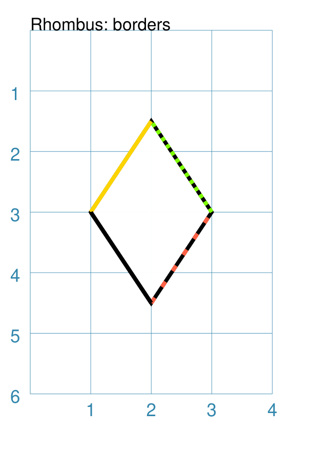
Example 3. Rhombus Border Styles
|
This example shows the shape constructed using the command with these properties: Rhombus(
cx=2, cy=3, width=2, height=3,
borders=[
("nw", 2, gold),
("ne", 2, lime, True),
("se", 2, tomato, [0.1, 0.2]),
("sw", 2)
]
)
It has the following properties set for it:
|
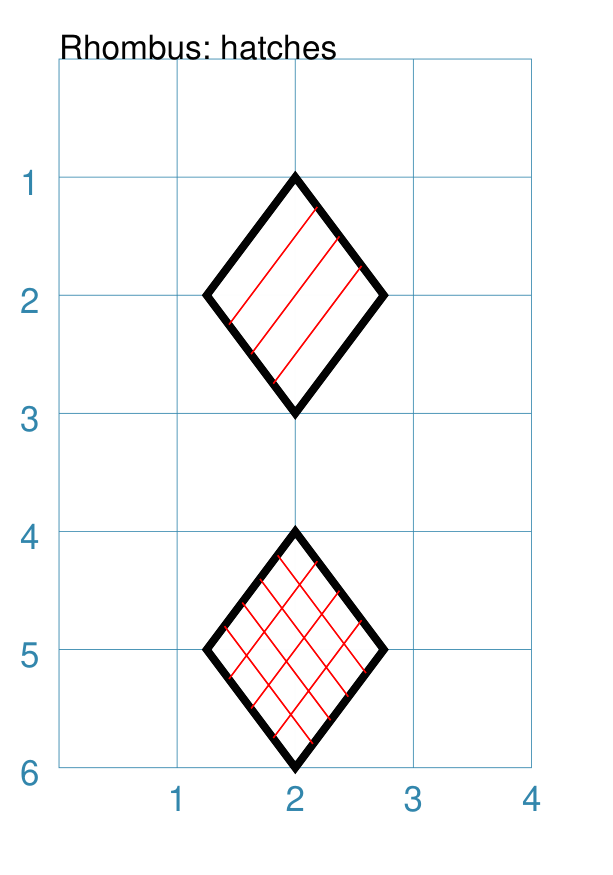
Example 4. Rhombus Hatches
|
This example shows the shape constructed using the command with these properties: Rhombus(
cx=2, cy=2,
width=1.5, height=2,
stroke_width=2,
hatches="ne sw",
hatches_count=3,
hatches_stroke="red"
)
Rhombus(
cx=2, cy=5,
width=1.5, height=2,
stroke_width=2,
hatches=[("nw", 4), ("ne", 3)],
hatches_stroke="red"
)
Both examples have the following properties set:
The top example shows:
The lower example shows:
|
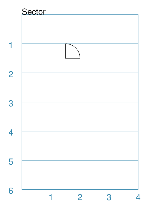
Sector
A Sector is like the triangular-shaped wedge that is often cut from a pizza or cake. It extends from the centre of a “virtual” circle outwards to its enclosing diameter. The two “arms” of the sector will cover a certain number of degrees of the circle (from 1 to 360).
Example 1. Default Sector
|
This example shows the shape constructed using the command with only defaults: Sector()
It has the following properties based on the defaults:
The sector is then drawn inside a circle of radius |
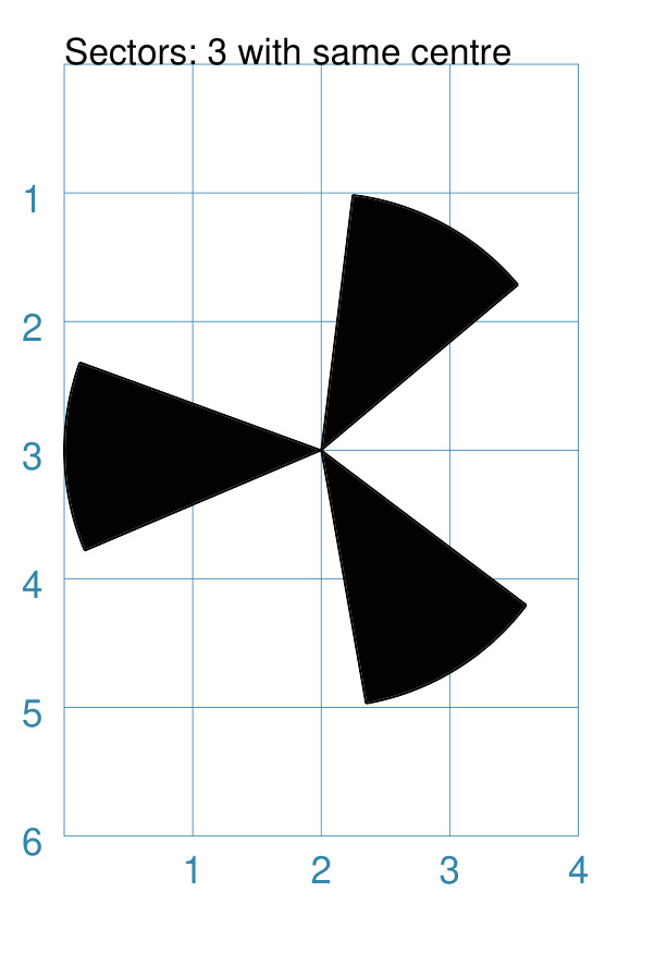
Example 2. Customised Sector
|
This example shows examples of the Sector constructed using commands with the following properties. Note the use of the Common command to allow multiple Sectors to share the same properties. sctm = Common(
cx=2, cy=3, radius=2,
fill="black", angle_width=43)
Sector(common=sctm, angle_start=40)
Sector(common=sctm, angle_start=160)
Sector(common=sctm, angle_start=280)
These all have the following
Each Sector in this example is drawn at a different angle_start. This represents a “virtual” centre-line extending through the sector, outwards from the centre of the enclosing “virtual” circle. |
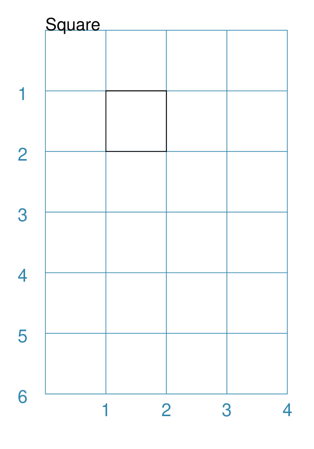
Square
A square shares almost all of the same properties as a Rectangle and so that shape, which has additional customisation options available, should also be referenced when working with this shape.
Example 1. Default Square
|
This example shows the shape constructed using the command with only defaults: Square()
It has the following properties based on the defaults:
|
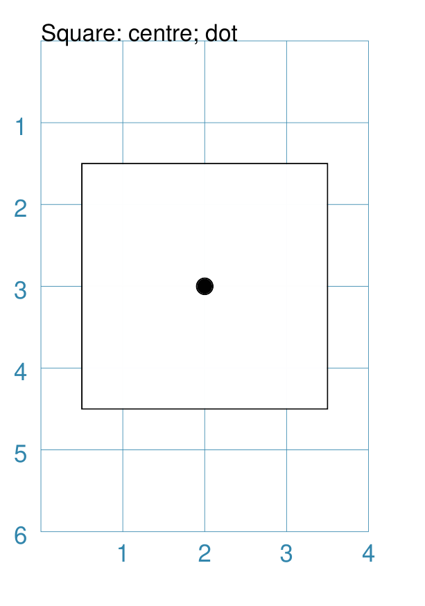
Example 2. Customised Square
|
This example shows the shape constructed using the command with these properties: Square(cx=2, cy=3, side=3, dot=0.1)
It has the following properties set for it:
|
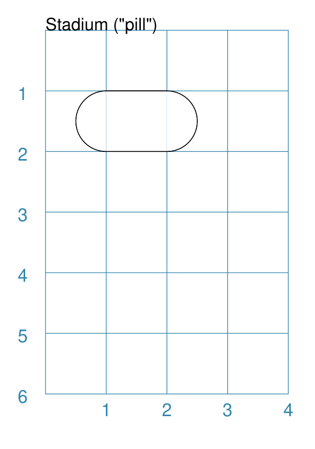
Stadium
A Stadium is a shape constructed with a rectangle as a base, and then curved projections added that extend from one or more of the sides.
In its default form, it may look like a pill.
Example 1. Default Stadium
|
This example shows the shape constructed using the command with only defaults: Stadium()
It has the following properties based on the defaults:
The default curved ends extend from the east/right and west/left sides. |
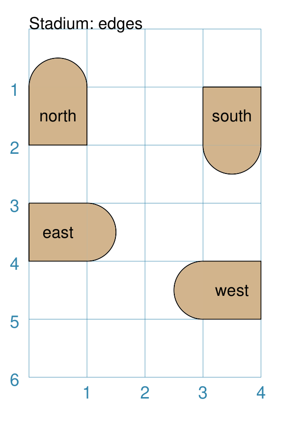
Example 2. Customised Stadium
|
This example shows example of the shape constructed using the command with the following properties: Stadium(
x=0, y=1, height=1, width=1, edges='n',
fill="tan", label="north")
Stadium(
x=3, y=1, height=1, width=1, edges='s',
fill="tan", label="south")
Stadium(
x=0, y=3, height=1, width=1, edges='e',
fill="tan", label="east")
Stadium(
x=3, y=4, height=1, width=1, edges='w',
fill="tan", label="west")
These have the following properties set:
The edges of the rounded projection(s) can be set using a letter to represent direction, where:
One or more edge values can be used together with spaces between them
e.g. |
Star
A Star is a multi-pointed shape; essentially made by joining points spaced equally around the circumference of an outer circle to points spaced equally around the circumference of a smaller “inner” circle.
To create other kinds of stars, see the “triangle” or “sun” petal shapes that can be created using a customised Circle.
Properties
A Star shape has the following additional properties:
rays - number of arms of the Star; defaults to
5inner_fraction - used to calulate the inner circle on which the other points used to draw the Star are placed; as this gets smaller, the width of the arms gets narrower; defaults to
0.5(one-half)show_radii - if
True, then lines are drawn from the Star centre to all of the points (inner and outer); default isFalseslices - a list of color values that will be used to color the triangles formed between the centre and the points of the rays
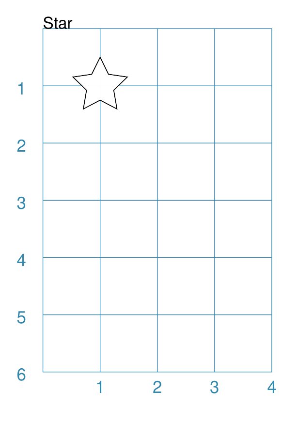
Example 1. Default Star
|
This example shows the shape constructed using the command with only defaults: Star()
The Star has the following properties based on the defaults:
|
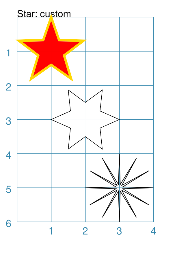
Example 2. Customised Star
|
This example shows the shape constructed using the command with these properties: Star(cx=1, cy=1, radius=1,
fill="red",
stroke="gold",
stroke_width=2,
inner_fraction=0.4,
)
Star(cx=2, cy=3, radius=1,
rays=6,
show_radii=True,
rotation=30,
)
Star(cx=3, cy=5, radius=1,
fill=None,
rays=12,
inner_fraction=0.1,
)
These have the following properties that differ from the defaults:
The upper Star has the default number of rays i.e.
The middle Star has:
The lower Star has:
|
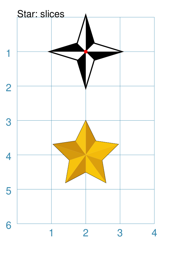
Example 3. Star with Slices
|
This example shows the shape constructed using the command with these properties: Star(cx=2, cy=1, radius=1,
rays=4,
inner_fraction=0.33,
stroke_width=2,
slices=["black", "white"],
dot=0.02,
dot_stroke="red",
)
Star(cx=2, cy=4, radius=1,
slices=[
"#CE8F0C",
"#F8C40C",
"#F3BA0B",
"#DB9F0D",
"#F8C609",
"#CE8F0C",
"#F7C30D",
"#D59A0E",
"#CE8F0C",
"#F7C615",
]
)
The upper Star has the following changes:
The lower Star has the default number of rays i.e.
NOTE that the coloring for the triangles starts in the righthand side of the “top” triangle — by default, a Star’s rays always start from 90°, or “north”. |
Starfield
A Starfield is a shape in which a number of small dots are scattered at random to simulate what might be seen when looking at a portion of the night sky.
The dots are drawn inside the boundaries of an “enclosure”; this can be a rectangle, a circle, or a polygon — but this shape is not, itself, drawn.
The number of dots drawn depends on the “density”, which is the product of the actual area of the shape multiplied by the density value.
Hint
If you want repeatable randomness - that is to say, the same sequence of random numbers being generated every time the program is run - then assign a value to the seeding property; for example:
Starfield(seeding=42)
The images used for this document are created with such a setting; but only to avoid the code repository detecting a “change” each time the script runs.
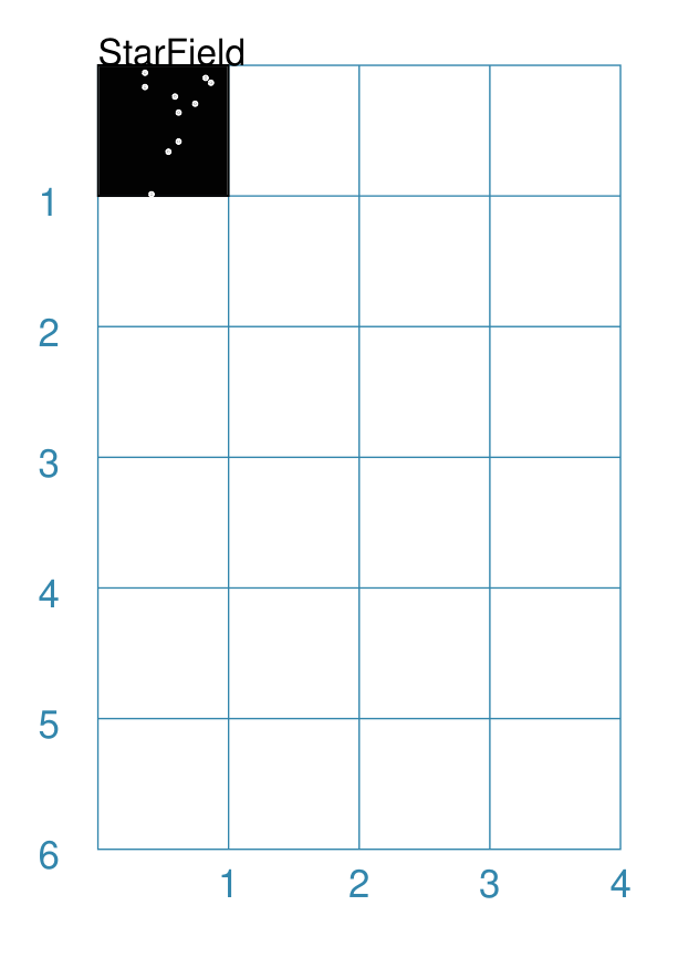
Example 1. Default Starfield
|
This example shows the shape constructed using the command with only defaults: Starfield()
It has the following properties based on the defaults:
Because the default fill color is |
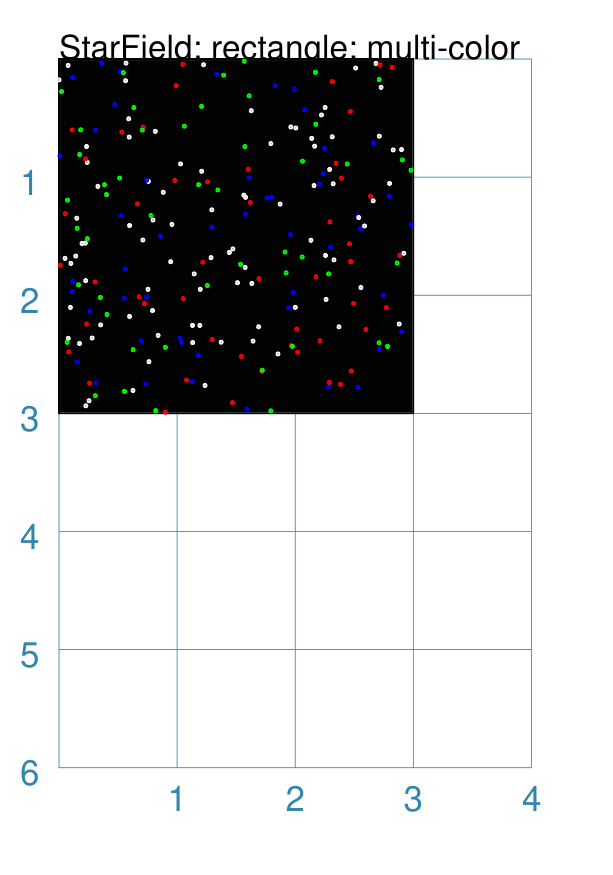
Example 2. Multiple Color Starfield
|
This example shows the shape constructed using the command with the following properties: StarField(
enclosure=rectangle(x=0, y=0, height=3, width=3),
density=80,
colors=[white, white, red, green, blue],
sizes=[0.4]
)
It has the following properties set:
Because the default fill color is white, this example adds an extra Rectangle() shape, with a fill color of black, which is drawn first and is hence “behind” the field of dots. |
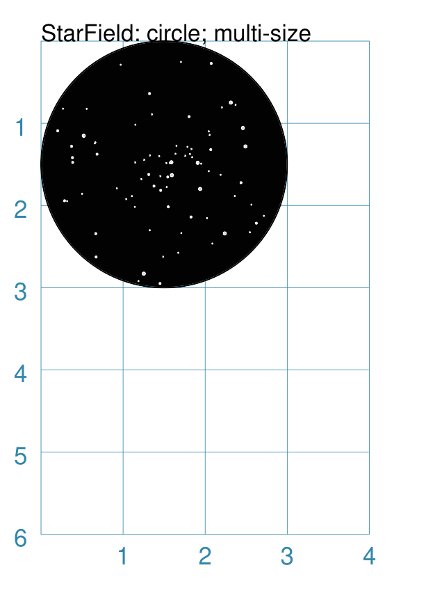
Example 3. Multiple Size Starfield
|
This example shows the shape constructed using the command with the following properties: StarField(
enclosure=circle(x=0, y=0, radius=1.5),
density=30,
sizes=[0.15, 0.15, 0.15, 0.15, 0.3, 0.3, 0.5]
)
It has the following properties set:
Because the default fill color is white, this example adds an extra Circle() shape, with a fill color of black, which is drawn first and is hence “behind” the field of dots. |
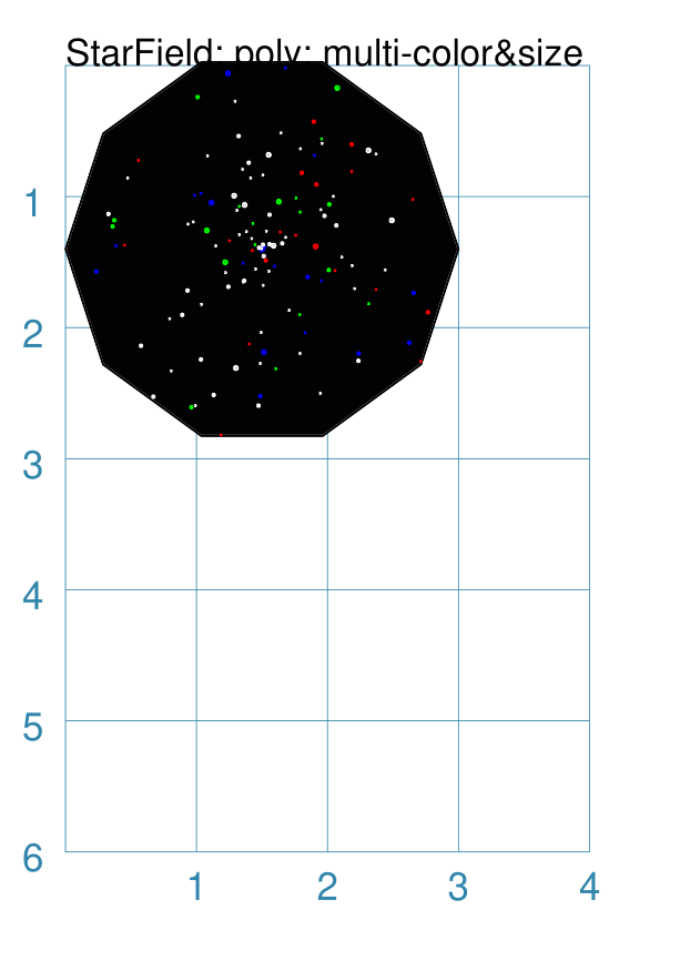
Example 4. Multiple Color & Size Starfield
|
This example shows the shape constructed using the command with the following properties: StarField(
enclosure=polygon(x=1.5, y=1.4, sides=10, radius=1.5),
density=50,
colors=["white", "white", "white", "red", "green", "blue"],
sizes=[0.15, 0.15, 0.15, 0.15, 0.3, 0.3, 0.45]
)
It has the following properties set:
Because the default fill color is white, this example adds an extra Polygon() shape, with a fill color of black, which is drawn first and is hence “behind” the field of dots. |
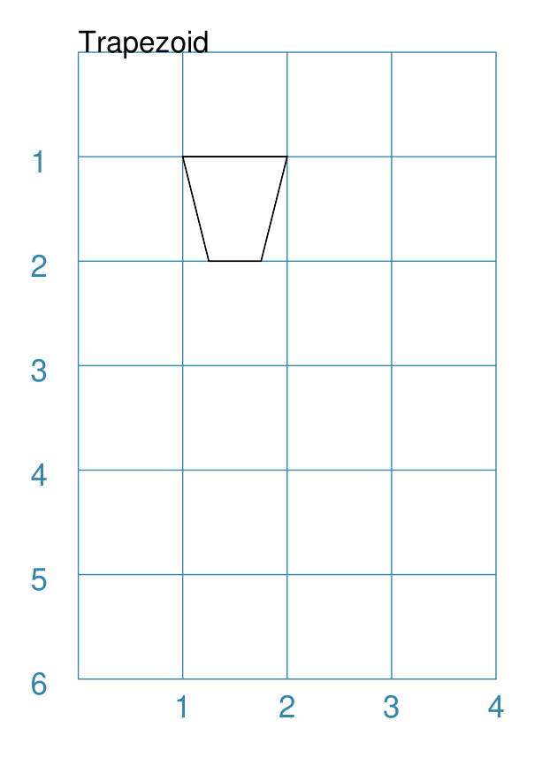
Trapezoid
Example 1. Default Trapezoid
|
This example shows the shape constructed using the command with only defaults: Trapezoid()
It has the following properties based on the defaults:
|
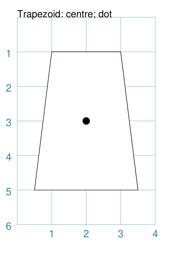
Example 2. Size & Flip Trapezoid
|
This example shows the shape constructed using the command with these properties: Trapezoid(
cx=2, cy=3, width=3, top=2, height=4, flip='s', dot=0.1)
It has the following properties set for it:
|
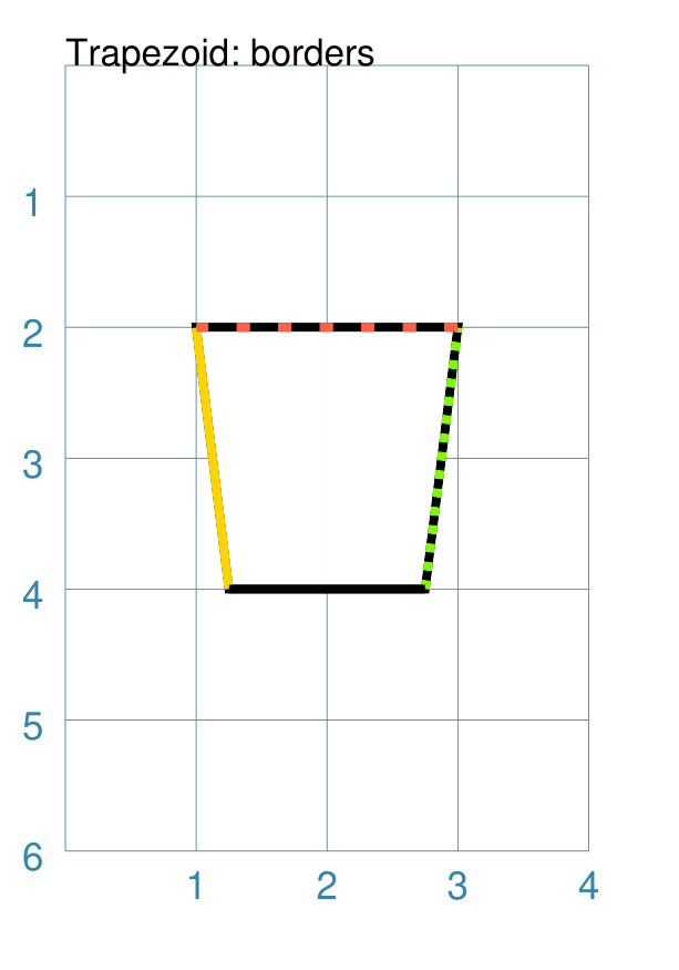
Example 3. Trapezoid Borders
|
This example shows the shape constructed using the command with these properties: Trapezoid(
cx=2, cy=3, width=2,
height=2, top=1.5,
stroke_width=2,
borders=[
("w", 2, "gold"),
("e", 2, "chartreuse", True),
("n", 2, "tomato", [0.1, 0.2]),
("s", 2)
]
)
It has the following properties set for it:
Borders’ direction and width are required, but color and style are optional. Multiple border directions can be used, with spaces between them,
e.g. |
Compound Shapes
Compound shapes are ones composed of multiple elements; but the program takes care of drawing all of them based on the properties supplied.
The following are all such shapes:
Blueprint
This shape is primarily intended to support drawing while it is “in progress”. It provides a quick and convenient underlying grid that can help to orientate and place other shapes that are required for the final product. Typically, one would just comment out this command when its purpose has been served.
On the grid, the values of x appear across the lower edge (increasing from left to right); those for y along the left side (increasing from top to bottom). The grid respects the margins that have been set but you will observe that the Blueprint numbering itself is located inside the margin area!
Different styling options are provided that can make the Blueprint more useful in different contexts.
Note
There is more detail about the various properties that can be defined for a Blueprint in the customised Blueprint section.
Example 1. Defaults
|
This example shows the shape constructed using the command with only defaults: Blueprint()
It has the following properties based on the defaults:
|
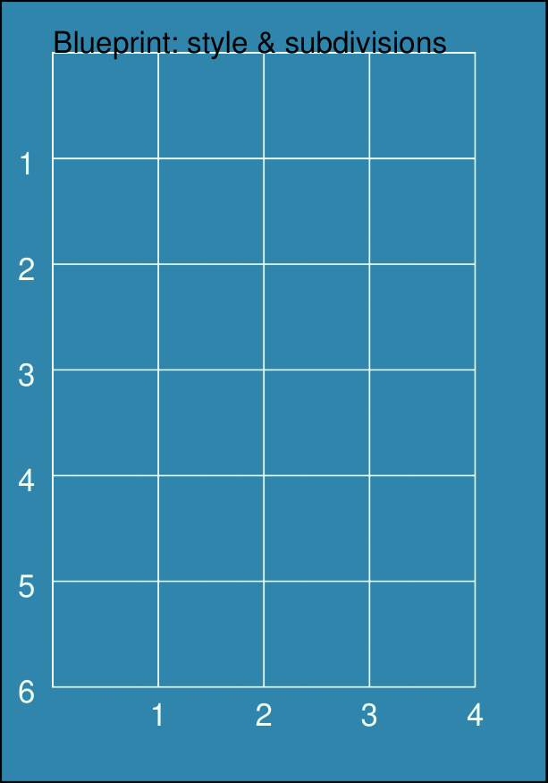
Example 2. Subdivisions & Style
|
This example shows the shape constructed using the command with these properties: Blueprint(
subdivisions=5,
stroke_width=0.5,
style='invert')
It has the following properties set:
The subdivisions are the thinner lines that are drawn between each pair of primary lines — they do not have any numbering and are dotted. |
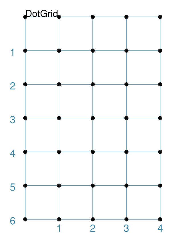
DotGrid
A DotGrid is a series of dots — both in the vertical and horizontal directions. This will, by default, fill the page, as far as possible, between its margins.
Example 1. Defaults
|
This example shows the shape constructed using the command with only defaults: DotGrid()
It has the following properties based on the defaults:
|
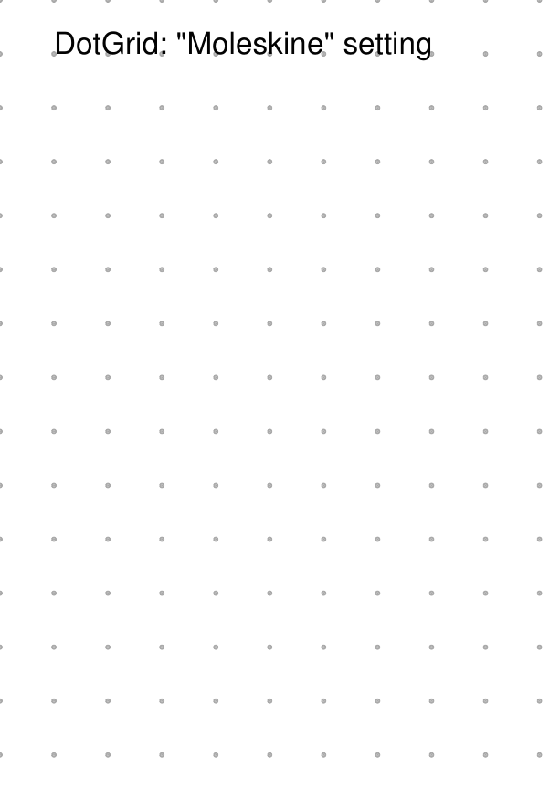
Example 2. Moleskine Grid
|
This example shows the shape constructed using the command with the following properties: DotGrid(
stroke="darkgray",
x=0, y=0,
width=0.5, height=0.5,
dot_width=1,
margin_fit=False)
To simulate the dot grid found in Moleskine notebooks, it has the following properties set:
Hint For a notebook page for actual use, you could consider setting the page color. To change the page color, set the fill property of the A color like |
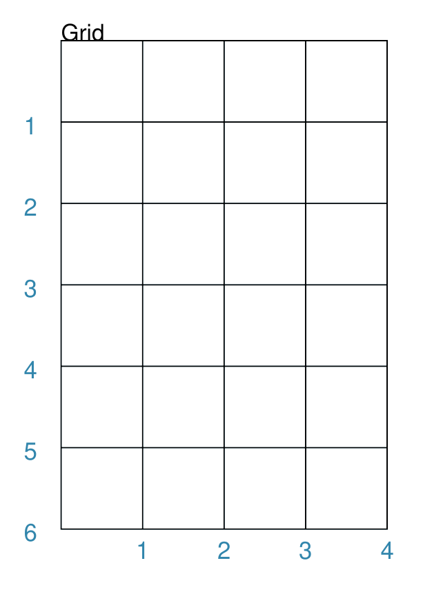
Grid
A Grid is a series of crossed lines — both in the vertical and horizontal directions. The Grid will, by default — i.e. if the exact number of rows and columns is not specified — fill the page as far as possible between its margins.
Note
The behaviour for a grid on a Card is little different, as a Card has no margins; so all x and y settings, such as those used by a grid are relative to the card edges.
Examples showing how the Grid can be styled are described below.
Example 1. Defaults
|
This example shows the shape constructed using the command with only defaults: Grid()
It has the following properties based on the defaults:
|
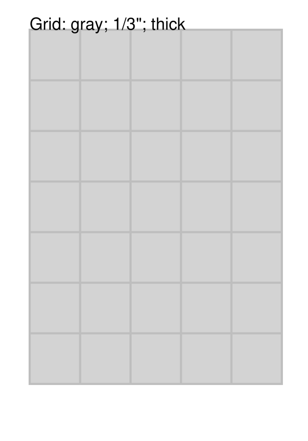
Example 2. Side, Stroke & Fill
|
This example shows the shape constructed using the command with the following properties (and without a Blueprint background): Grid(
side=0.85,
fill="lightgray",
stroke="gray",
stroke_width=1)
It has the following properties based on the defaults:
|
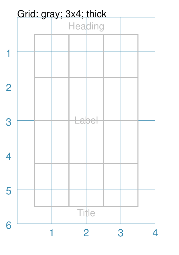
Example 3. Fixed Size
|
This example shows the shape constructed using the command with the following properties: Grid(
x=0.5, y=0.5,
height=1.25, width=1,
cols=3, rows=4,
stroke="gray",
stroke_width=1,
heading="Heading",
label="Label",
title="Title"
)
It has the following properties set for it:
The grid now has a fixed “rows by columns” size, rather than being automatically calculated to fill up the page. |
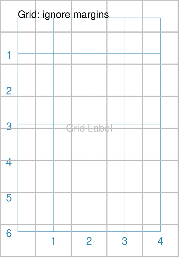
Example 4. Ignore Margins
|
This example shows the shape constructed using the command with the following properties: Grid(
x=0, y=0,
height=1.2, width=1,
stroke="gray",
stroke_width=1,
margin_fit=False,
label="Grid Label")
)
It has the following properties set for it:
The grid size has being automatically calculated to fill up the page. Note the use of margin_fit set to |
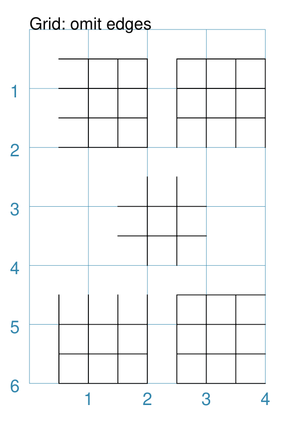
Example 5. Omit Edges
|
This example shows the Grid constructed using the command with the following properties: Grid(
x=0.5, y=0.5,
rows=3, cols=3,
side=0.5, stroke_width=0.5,
omit_left=True)
Grid(
x=2.5, y=0.5,
rows=3, cols=3,
side=0.5, stroke_width=0.5,
omit_bottom=True)
Grid(
x=1.5, y=2.5,
rows=3, cols=3,
side=0.5, stroke_width=0.5,
omit_outer=True)
Grid(
x=0.5, y=4.5,
rows=3, cols=3,
side=0.5, stroke_width=0.5,
omit_top=True)
Grid(
x=2.5, y=4.5,
rows=3, cols=3,
side=0.5, stroke_width=0.5,
omit_right=True)
Each of the grids have the following properties set:
In addition, each grid has an outer_… property set to |
Image
Pedantically speaking, an image is not like the other shapes in the sense that it does not consist of lines and areas drawn by protograf itself.
An “image” refers to an external file which is simply inserted into the page at the location.
The Image shape shares a number of common aspects with other shapes — such
as its x & y (“top left”) positions, a width and a height, the
ability to be rotated, and the addition of text in form of a label,
heading or title.
If an image has a transparent area, this will be respected and shapes drawn previously by the script may then be visible “below” it (see examples below). An image can also be “drawn over” by other shapes appearing later on in the script.
The following examples show how an image can be added to, or altered:
Example 3. Auto Frame (calculate height from width or vice-versa)
Example 4. Alignment (set the image’s “anchor” point)
Example 6. Sliced Images (extract image “thirds”)
Example 7: Operations (“cutout” shapes, rounding, and blurred edges)
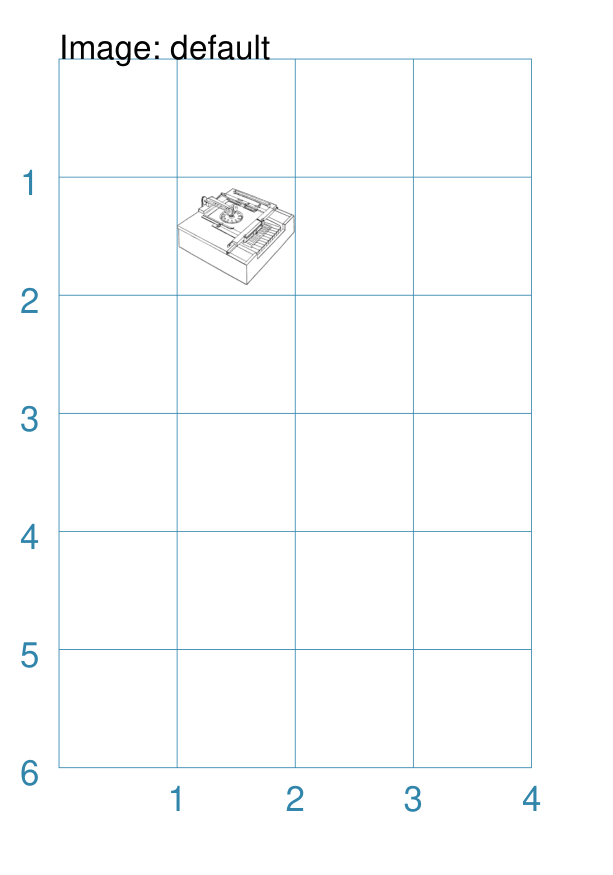
Example 1. Default Image
|
If the Image was constructed using only default properties, there will be nothing to see and an error will be displayed: Image()
Will show this message: FEEDBACK:: Unable to load image - no name provided
This example then shows the shape constructed with just a single property: Image("sholes_typewriter.png")
This first, unnamed property is the filename of the image. If no directory is supplied for the image, it is assumed to be in the same directory as that of the script. The image has the following other properties based on the defaults:
Hint The size set for the image may distort it if the ratios do not match those of the image itself. |
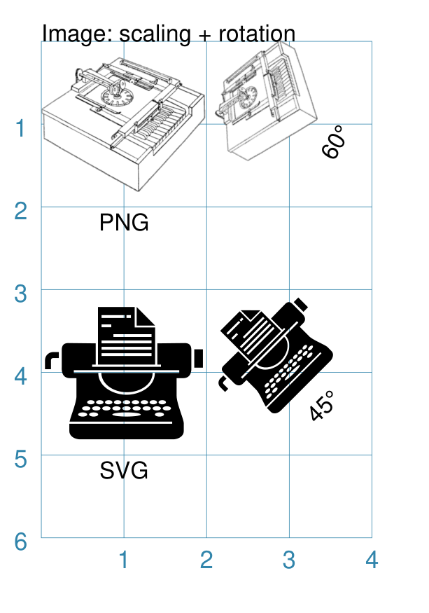
Example 2. Rotation & Scaling
Note
protograf does not currently do image scaling in the
sense of altering the image dimensions of the actual image file.
Instead, by setting its height and width properties, the image
can appear in the output at the size required.
Bear in mind that larger images will increase the size of the output PDF file accordingly, regardless of how small they appear on a page.
|
This example shows the Image constructed using the command with the following properties: Image(
"sholes_typewriter.png",
x=0, y=1,
width=2.0, height=2.0,
title="PNG")
Image(
"sholes_typewriter.png",
x=2, y=1,
width=1.5, height=1.5,
title="60\u00B0",
rotation=60)
Image(
"noun-typewriter-3933515.svg",
x=0, y=4,
width=2.0, height=2.0,
title="SVG")
Image(
"noun-typewriter-3933515.svg",
x=2, y=4,
width=1.5, height=1.5,
title="45\u00B0",
rotation=45)
Each image has the following properties set for it:
Each set of images has different sizes to simulate image scaling. The two left-hand images have:
The two right-hand images have:
The two right-hand images are rotated about a centre point:
The image centre is calculated based on it’s height and width. |
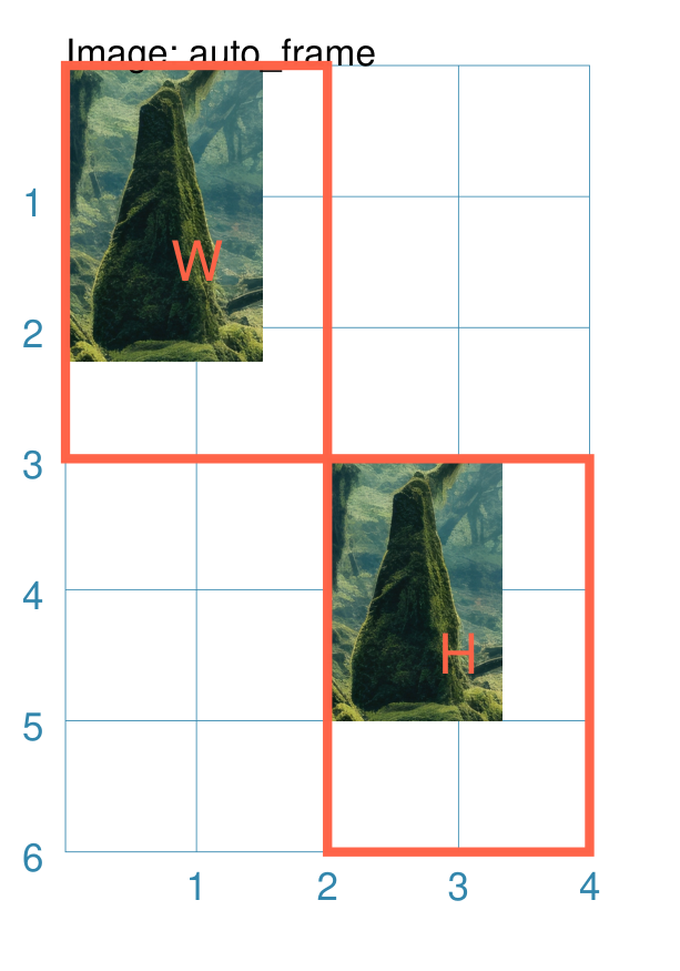
Example 3. Auto Frame
Normally the frame — or size of the Image occupied on the page — is
done by setting both its height and width properties.
However, it is possible to set either height and width, and then
set auto_frame=True to have the other dimension automatically calculated
based on the relative dimensions of the image itself.
If both height and width are set, then auto_frame will not be
used.
|
This example shows the Image constructed using the command with the following properties: img_file = "fantasy-forest-with-old-bridges-crop.jpg"
Image(
img_file,
x=0, y=0,
width=1.5, auto_frame=True)
Rectangle(x=0, y=0, label="W", common=rred)
Image(
img_file,
x=2, y=3,
height=2, auto_frame=True)
Rectangle(x=2, y=3, label="H", common=rred)
In the top-left example, the width has been set for the Image, and
then the height is automatically calculated; in this case because the
image is 900 pixels high by 600 pixels wide, the height is about
In the lower-right example, the height has been set for the Image, and
then the width is automatically calculated; in this case because the
image is 900 pixels high by 600 pixels wide, the width is about
|
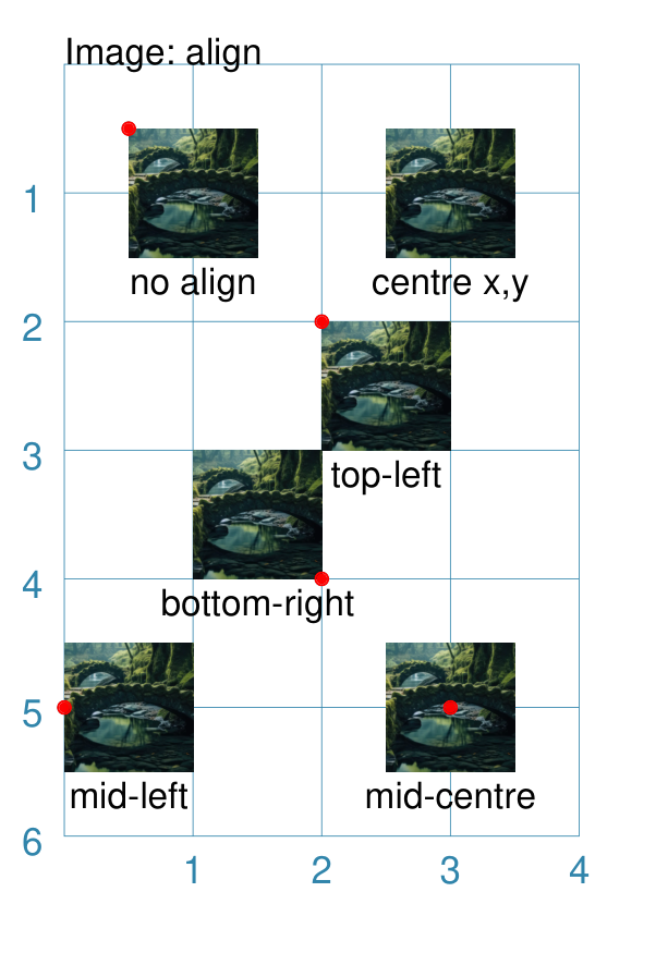
Example 4. Alignment
Image alignment is somewhat similar to alignment of Text.
Instead of the shape’s x and y values defining the top-left position,
the use of either, or both, align_horizontal or align_vertical can cause
the shape to be located in a different relative position.
The align_horizontal property can take on values of "left", "centre"
or "right"; the align_vertical property can take on values of "top",
"middle" or "bottom". These are illustrated in the exampe below.
|
This example shows the Image constructed using the command with the properties shown. Note the use of the Common command to allow multiple Images to share the same properties. rdot = Common(fill_stroke="red", radius=0.05)
image_file = "fantasy-forest-with-old-bridges.png"
Image(image_file,
width=1, height=1,
x=0.5, y=0.5,
title="no align")
Circle(common=rdot, cx=0.5, cy=0.5)
Image(image_file,
width=1, height=1,
cx=3, cy=1,
title="centre x,y")
Image(image_file,
width=1, height=1,
x=2, y=4,
align_horizontal="right",
align_vertical="bottom",
title="bottom-right")
Circle(common=rdot, cx=2, cy=4)
Image(image_file,
width=1, height=1,
x=2, y=2,
align_horizontal="left",
align_vertical="top",
title="top-left")
Circle(common=rdot, cx=2, cy=2)
Image(image_file,
width=1, height=1,
x=0, y=5,
align_horizontal="left",
align_vertical="mid",
title="mid-left")
Circle(common=rdot, cx=0, cy=5)
Image(image_file,
width=1, height=1,
x=3, y=5,
align_horizontal="centre",
align_vertical="mid",
title="mid-centre")
Circle(common=rdot, cx=3, cy=5)
The top-left image is set using defaults i.e. no alignment. The top right-hand image position is set using a centre point; for such a setting, no alignment can be used. The other images have a small red dot superimposed on them, set to the same value as the x and y used to position the shape; this helps show how the image is drawn relative to that position. |
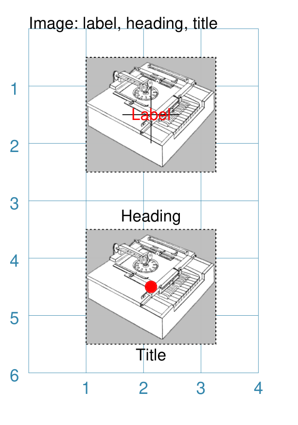
Example 5. Captions and Markings
|
This example shows shapes constructed using their command with the following properties: Text(common=txt, text="Image: label, heading, title")
Rectangle(
width=2.26, height=2, x=1, y=0.5,
dotted=True, fill="silver")
Image("sholes_typewriter.png",
width=2.26, height=2, x=1, y=0.5,
label="Label", label_stroke='red',
cross=True)
Rectangle(
width=2.26, height=2, x=1, y=3.5,
dotted=True, fill="silver")
Image("sholes_typewriter.png",
width=2.26, height=2, x=1, y=3.5,
heading="Heading",
title="Title",
dot=0.1, dot_stroke='red')
In this example, a grey-filled rectangle, with dotted border, is drawn just prior to the image. The same image is used in two places here to demonstrate the following:
|
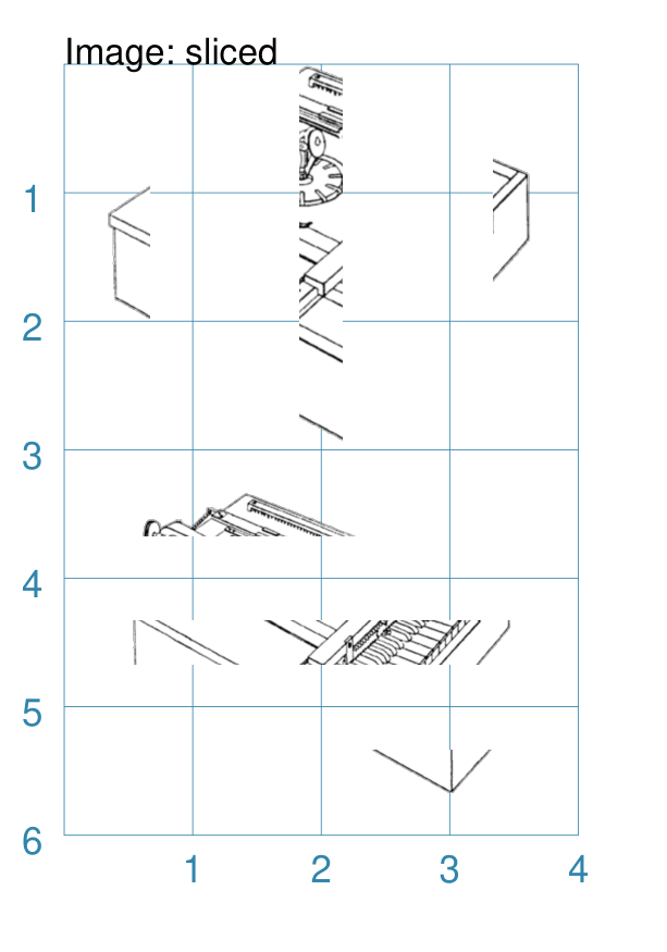
Example 6. Sliced Images
|
This example shows the Image constructed using the command with the following properties: Image("sholes_typewriter.png", sliced='l',
width=1, height=3, x=0, y=0)
Image("sholes_typewriter.png", sliced='c',
width=1, height=3, x=1.5, y=0)
Image("sholes_typewriter.png", sliced='r',
width=1, height=3, x=3, y=0)
Image("sholes_typewriter.png", sliced='t',
width=3, height=1, x=0.5, y=3)
Image("sholes_typewriter.png", sliced='m',
width=3, height=1, x=0.5, y=4)
Image("sholes_typewriter.png", sliced='b',
width=3, height=1, x=0.5, y=5)
Here the sliced property is used to “slice” off portions of the image. In the upper example:
In the lower example:
|
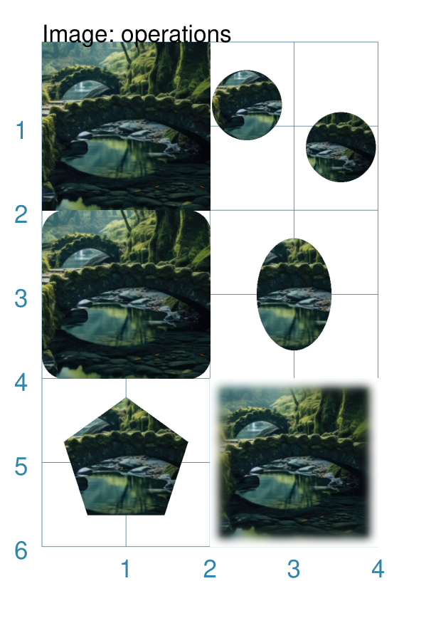
Example 7: Operations
It is possible change the way an Image appears by either creating a “cut-out” from it, or by blurring the edges. These changes are termed operations.
Each operation is specified by its name, followed by one or more settings,
in list format (i.e. inside [...] brackets). Be aware that values used
for these operations are pixel-based values and do not correspond to the
units used elsewhere in protograf.
The cut-out operations are:
circle (or
c): cut-out a circle; this must be followed by the radius, in pixels, of the circleellipse (or
e): cut-out an ellipse; this must be followed by the width and height — inside(...)brackets — in pixels, of the ellipsepolygon (or
p): cut-out a regular polygon; this must be followed by the radius, in pixels, of the polygon; and an optional number for the number of sides of the polygon — the default is 6 (a hexagon)rounding (or
r): cut-out a rounded portion of each corner of the image; this must be followed by the radius, in pixels, of the cutout size
By default, the cutout center matches the center of the image; but it is possible to shift the center by adding two values for the x- and y-shift, in pixels, respectively. This shift does not apply to rounding.
The blur operation is:
blur (or
b): blur the edges; this must be followed by the radius, in pixels, of the size of the blur
|
This example shows the Image constructed using the command with the following properties: Image("fantasy-forest-with-old-bridges.png",
width=2, height=2,
x=0, y=0)
Image("fantasy-forest-with-old-bridges.png",
width=1.5, height=1.5,
x=2, y=0,
operation=['circle', 100, 75, -75]
)
Image("fantasy-forest-with-old-bridges.png",
width=1.5, height=1.5,
x=2.5, y=0.5,
operation=['circle', 100, -75, 75]
)
Image("fantasy-forest-with-old-bridges.png",
width=2, height=2,
x=0, y=2,
operation=['rounding', 50]
)
Image("fantasy-forest-with-old-bridges.png",
width=2, height=2,
x=2, y=2,
operation=['ellipse', (160, 240)]
)
Image("fantasy-forest-with-old-bridges.png",
width=2, height=2,
x=0, y=4,
operation=['polygon', 140, 5]
)
Image("fantasy-forest-with-old-bridges.png",
width=2, height=2,
x=2, y=4,
operation=['blur', 20]
)
The top-left image is the original, while the others show the result of an operation. Note that the two circle operations use offset values to move the centre of where the cutout happens. |
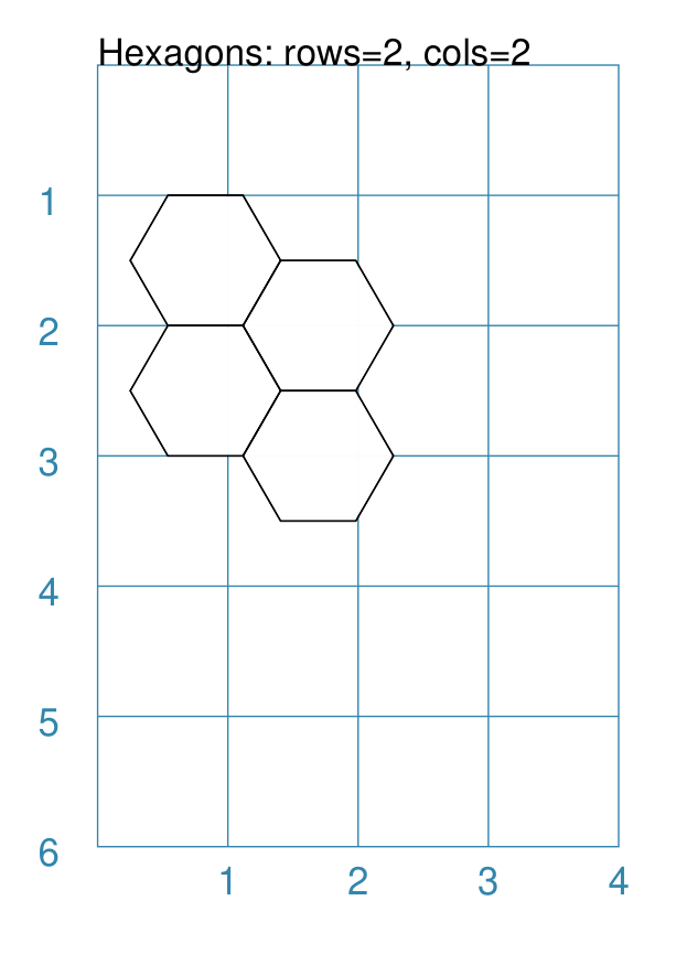
Hexagons
Hexagons are often drawn in a “honeycomb” arrangement to form a grid. For games this is often used to delineate the spaces in which playing pieces can be placed and their movement regulated.
Note
Very detailed information about using hexagons in grids can be found in the section on Hexagonal Grids.
Example 1. Hexagons Defaults
|
This example shows the shape constructed using the command with two basic properties; the number of rows and columns in the grid: Hexagons(rows=3, cols=3)
It has the following properties based on the defaults:
|
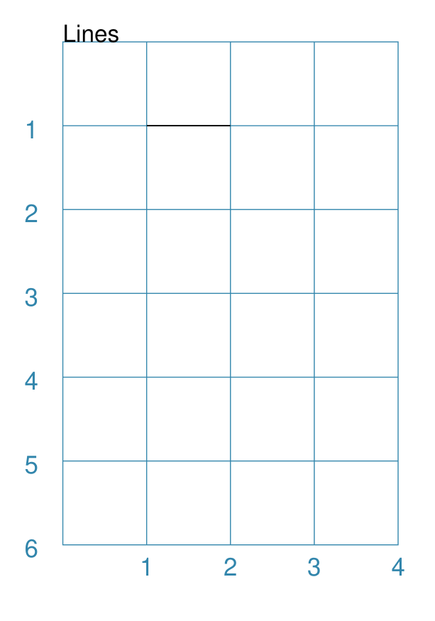
Lines
Lines are simply a series of parallel lines drawn over repeating rows - for horizontal lines - or columns - for vertical lines.
Example 1. Lines Defaults
|
This example shows the shape constructed using the command with only defaults: Lines()
It has the following properties based on the defaults:
|
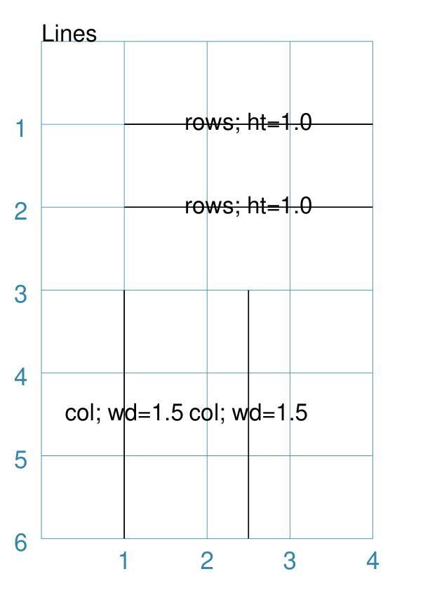
Example 2. Customised Lines
|
This example shows the shapes constructed using the command with the following properties: Lines(
x=1, y=1, x1=4, y1=1,
rows=2, height=1,
label_size=8, label="rows; ht=1.0")
Lines(
x=1, y=3, x1=1, y1=6,
cols=2, width=1.5,
label_size=8, label="col; wd=1.5")
The first command has the following properties:
The second command has the following properties:
Note that the label that has been set applies to every line that is drawn. |
Rectangles
Rectangles can be drawn in a row-by-column layout to form a grid. For games this is often used to delineate a track or other spaces in which playing pieces can be placed.
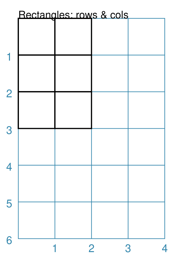
Example 1. Rectangles: Columns and Rows
|
This example shows the shape constructed using the command with these properties: Rectangles(
rows=3, cols=2,
stroke_width=1)
It has the following properties:
There are 3 rows — the y-direction — and 2 columns — the x-direction. |
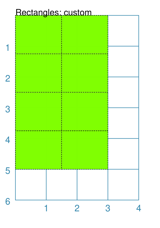
Example 2. Customised Rectangles
|
This example shows the Rectangles constructed using the command with these properties: Rectangles(
cols=2, rows=4,
width=1.5, height=1.25,
fill="chartreuse",
dotted=True)
It has the following properties based on the defaults:
|
Table
Tables are an arrangement of styled rectangles in a column-and-row layout.
Either the rows and columns are split evenly across the Table’s height and width, or the values of each column and/or row can be set via lists of values.
Table colors and line styles can be set as described in the examples below, as can the cell padding — the “white space” around the inner-edges of a cell.
Tables do not, themselves, contain any information. However, any of the “cells” in a table can be accessed using a spreadsheet-like notation to make use of their location and size to display other shapes or elements.
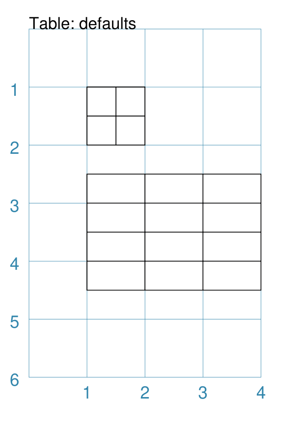
Example 1. Table Basics
|
This example shows the Table constructed using the command with these properties: Table(cols=2, rows=2)
Table(y=2.5,
width=3, height=2,
cols=3, rows=4)
The first Table has the following properties:
There are 2 rows — in the y-direction — and 2 columns in — the x-direction. This is the minimum allowed. The second Table has the following properties:
There are 4 rows — in the y-direction — and 3 columns in — the x-direction. Each row is equal in size as is each column. |
Example 2. Customised Table
|
This example shows the Table constructed using the command with these properties: Table(y=0,
width=3, height=2.5,
cols=5, rows=6,
stroke="red", dotted=True)
Table(y=3, x=0,
cols=[0.5, 1, 1.25, 0.75],
rows=[0.75, 0.5, 0.5, 0.75],
stroke="blue", fill="aqua",
borders=('*', 2, "grey"))
The first Table has the following properties:
The second Table has the following properties:
|
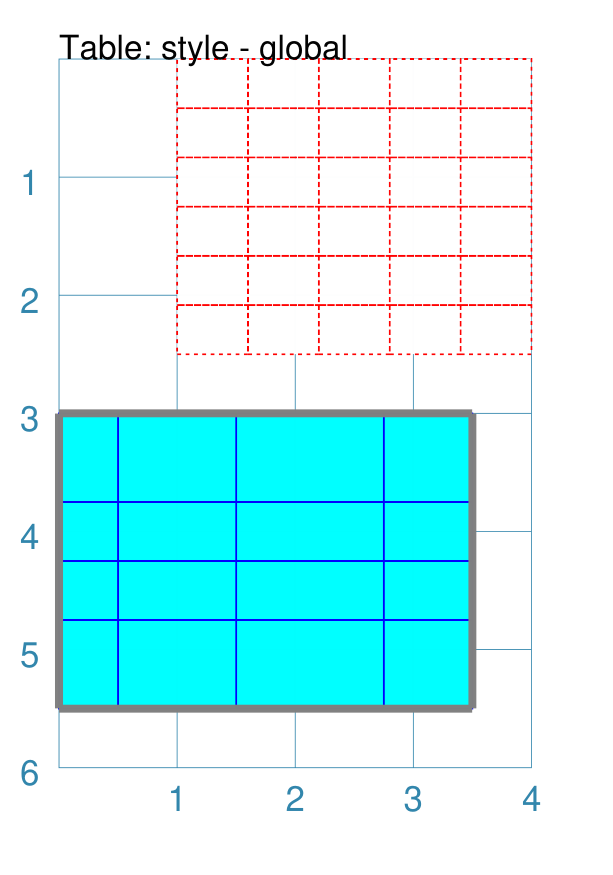
Example 3. Customised Table Rows and Columns
|
This example shows the Table constructed using the command with these properties: t1 = Table(
x=0.5, y=0.5,
width=3, height=2,
cols=5, rows=5,
disable_row=True,
stroke="red", stroke_width=1,
fill="gold",
borders=('e w', 2, "grey"),
)
t2 = Table(
x=0, y=3,
cols=[0.5, 1, 1.25, 0.75],
rows=[0.75, 0.5, 0.5, 0.5, 0.75],
disable_col=True,
stroke="grey", stroke_width=1,
fill="aqua",
borders_header=('n s', 2, "black"),
borders_footer=('s', 2, "red", True),
)
The first Table has the following properties:
The first table also has the setting The second Table has the following properties:
The second table also has the setting In addition, the second table also demonstrates the use of border styles for the first — header — and last — footer — rows. The syntax for these styles follows that for the table borders — see Example 2. Customised Table. |
Example 4. Locating shapes at a Table cell
To locate a shape where a Table’s cell has been drawn, you can make use of
the Table’s cell property to reference its top-left point (xy`),
centre point (``cxy) or height and width.
A cell is referenced using a spreadsheet-style notation, linked to the name
assigned to the Table; for example, if the Table is called T1 then a
reference to the top-left cell would be T1.cell("A1"). The height of
that cell would be referenced as T1.cell("A1").height.
Note
It should be noted that protograf itself has no concept of anything being “contained” in a cell, nor does it have any mechanism to ensure that shapes are drawn within what might appear to be cell boundaries. It is up to the script author to ensure that the shapes are positioned and sized correctly to achieve this!
|
This example shows the Table constructed using the command with these properties: tt = Table(
x=0.25, y=1,
cols=[1, 2, 0.75],
rows=[0.75, 1, 1.25, 0.75],
stroke="grey", stroke_width=0.5,
borders_header=('n s', 1, "black"),
borders_footer=('s', 1, "black"),
padding=0.05,
)
picture = "fantasy-forest-with-old-bridges-crop.jpg"
Image(
picture,
xy=tt.cell("A2").xy,
height=tt.cell("A2").height)
Image(
picture,
xy=tt.cell("A3", 0, 0).xy,
height=tt.cell("A3", 0, 0).height)
Image(
picture,
xy=tt.cell("A4").xy,
height=tt.cell("A4").height)
Text(
xy=tt.cell("B2").xy,
height=tt.cell("B2").height,
width=tt.cell("B2").width,
html=True, box_fill="orange",
text="""All the King's ponies and all the King's men?
""")
Text(
xy=tt.cell("B3").xy,
height=tt.cell("B3").height,
width=tt.cell("B3").width,
html=True, box_fill="tan",
text="""Now is the time for all good men
to come to the aid of their party.
""")
Text(
xy=tt.cell("B4").xy,
height=tt.cell("B4").height,
width=tt.cell("B4").width,
html=True, box_fill="silver",
text="""Fly, you fools!
""")
Circle(
cxy=tt.cell("C2").cxy,
radius=0.25, fill="tomato")
Square(
cxy=tt.cell("C3").cxy,
side=0.5, fill="green")
Hexagon(
cxy=tt.cell("C4").cxy,
side=0.25, fill="aqua")
This example shows a table, styled in a similar way to previous examples,
and assigned the name The A cell is referenced using a spreadsheet-style notation — here the
upper-left cell is A cell’s attributes include its top-left point ( It should be noted that:
|
Shapes Common Properties
The following are properties common to many shapes that can be set to create the desired output:
Note
The term “common” in this section is referring to the concept that many shapes are properties with the same names and similar behaviour. This makes it a bit easier to use and remember them. In protograf the Common command has the specific meaning of setting the same property value(s) to be used in multiple shapes in the same script — as seen in various of the examples here.
x and y
Almost every shape will need to have its position set. “Position” here usually refers to a point corresponding to the top-left of that shape.
The common way to do this is by setting a value for x — the distance from the left margin of the page (or card) to the left edge of the shape; and/or y — the distance from the top margin of the page (or card) to the top edge of the shape.
Note
Its more appropriate to think of this position as that of the “bounding box” of the shape i.e. imagine a rectangle drawn such that the shape just fits inside it; the “position” is the point corresponding to the top-left of that imaginary Rectangle.
cx and cy
Almost every shape will need to have its position set. “Position” here refers to a point corresponding to the centre of that shape.
For shapes that support it, the way to do this is by setting a value for cx — the distance from the left margin of the page (or card) to the centre position of the shape and/or cy — the distance from the bottom margin of the page (or card) to the centre position of the shape.
Fill and Stroke
Almost every single shape will have a stroke, corresponding to the color of the line used to draw it, and a stroke_width which is the thickness in points (72 points per inch); the default line color is black.
All Enclosed Shapes will have a fill corresponding to the color used for the area inside it; the default fill color is white.
A “shortcut” to setting both fill and stroke to be the same for a shape, is to use the property fill_stroke (see Example 2 below).
If the fill is set to the keyword None
(note the uppercase “N”), the area will have no fill color, and effectively
becomes transparent.
If the stroke is set to the keyword None
(note the uppercase “N”), the line will have no color, and effectively
becomes transparent.
Example 1. Fill & Stroke
|
This example shows a shape constructed using the command: Rectangle(
fill="yellow", stroke="red",
stroke_width=6)
The shape has the following properties that differ from the defaults:
It can be seen that very thick lines “straddle” a centre line running through the defined location. In this case the Rectangle is both larger in outer dimensions than the expected 1x1 cm and smaller in inner dimensions than the expected 1x1 cm due to the thickness of the lines used to construct it. |
Example 2. Fill_Stroke
The fill_stroke property is a “shortcut” which sets both the fill and stroke color at same time.
|
This example shows a shape constructed using the command: Circle(fill_stroke="cyan")
The shape has the following property that differ from the defaults:
Here, the line color used to draw the circumference is the same as the fill color of the interior. |
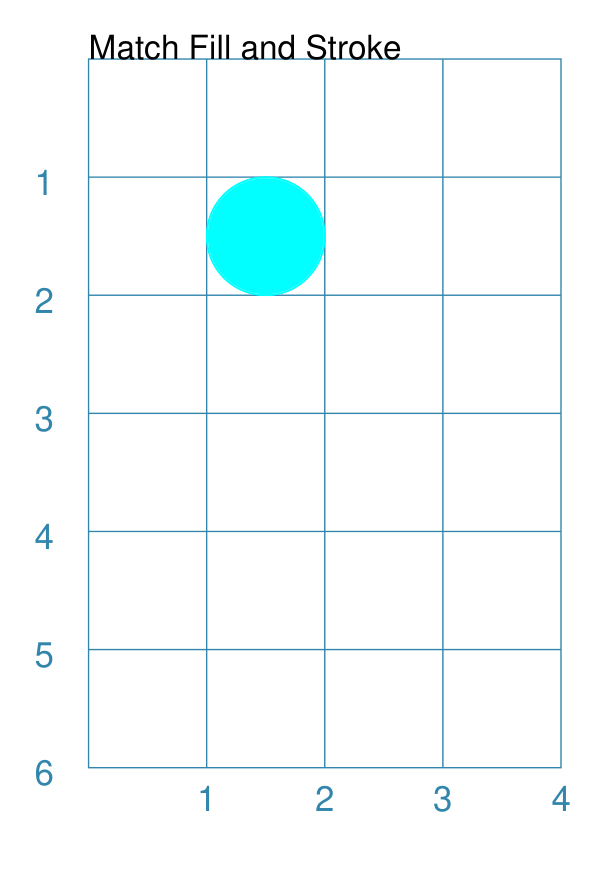
Dot and Cross
For shapes that have a definable centre e.g. a Circle, a Square or a Hexagon, it is possible to place a dot, a cross, or both at this location.
The color for the dot and cross will, if not provided, take on the stroke color of the shape of which they are part — see the Stadium example below.
|
This example shows various shapes constructed using the following commands: Stadium(
cx=1, cy=1, side=0.66,
stroke="blue",
dot=0.1)
Stadium(
cx=3, cy=1, side=0.66,
stroke="blue",
cross=0.25,
cross_stroke_width=1)
Polygon(
cx=1, cy=3, sides=8,
radius=1,
dot=0.1,
dot_stroke="orange")
Polygon(
cx=3, cy=3, sides=8, diameter=2,
cross=0.25,
cross_stroke="orange",
cross_stroke_width=1)
Rhombus(
cx=1, cy=5, side=1.25,
dot=0.1,
dot_stroke="red")
Rhombus(
cx=3, cy=5, side=1.25,
cross=0.25,
cross_stroke="red",
cross_stroke_width=1)
The shapes have their properties set as follows:
|
Rotation
Every shape, whose centre can be calculated, will support a rotation property. Rotation takes place in anti-clockwise direction, from the horizontal, around the centre of the shape, in degrees. (An exception is the Band shape.)
Example 1. Rhombus Rotation
|
This example shows the shape constructed using these commands: Rhombus(
cx=2, cy=3,
width=1.5,
height=2*equilateral_height(1.5),
fill=None, stroke="black",
dot=0.06)
Rhombus(
cx=2, cy=3,
width=1.5,
height=2*equilateral_height(1.5),
fill=None, stroke="red",
dot=0.03,
rotation=60)
The shape with the black outline and large dot in the centre is the “normal” Rhombus. The shape with the red outline and smaller, red dot in the centre is the rotated Rhombus. It has these properties:
The shapes are completely transparent, so its possible to see how the second is drawn relative to the first. |
Example 2. Polygon Rotation
|
This example shows five Polygons constructed using the command with additional properties. Note the use of the Common command to allow multiple Polygons to share the same properties. poly6 = Common(
fill=None,
sides=6,
diameter=1,
stroke_width=1)
Polygon(common=poly6,
y=1, x=1.0, label="0")
Polygon(common=poly6,
y=2, x=1.5, rotation=15,
label="15")
Polygon(common=poly6,
y=3, x=2.0, rotation=30,
label="30")
Polygon(common=poly6,
y=4, x=2.5, rotation=45,
label="45")
Polygon(common=poly6,
y=5, x=3.0, rotation=60,
label="60")
The examples have the following properties:
|
Example 3. Shapes Rotation
|
This example shows different shapes constructed using commands with some Common properties: props = Common(
stroke="black",
cross=0.5, cross_stroke="red",
cross_stroke_width=1,
rotation=45, label_size=6)
Star(
x=1, y=1, vertices=5, radius=0.75,
common=props, label="star")
Ellipse(
cx=3, cy=1, height=1, width=1.5,
common=props, label="ellipse")
Polygon(
cx=1, cy=3, sides=6, side=0.75,
common=props, label="polygon")
Stadium(
cx=3, cy=3, side=0.6,
common=props, label="stadium")
Rectangle(
cx=1, cy=5, height=1, width=1.5,
common=props, label="rectangle")
Rhombus(
cx=3, cy=5, side=1.25,
common=props, label="rhombus")
The shapes share common properties for the cross at the centre, with a rotation of 45° each. |
Example 4. Rotation with Hatches
|
This example shows different shapes constructed using commands with
some htch = Common(
fill='lightgray', stroke=None,
hatches_count=5,
hatches='w',
hatches_stroke="red",
hatches_stroke_width=0.75,
rotation=30)
Hexagon(
common=htch,
cx=2, cy=1, height=1.5,
)
Triangle(
common=htch,
cx=1, cy=3, side=1.5,
)
Circle(
common=htch,
cx=3, cy=3, radius=0.75,
)
Rectangle(
common=htch,
x=0.5, y=4, height=1.5, width=1,
)
Rhombus(
common=htch,
cx=3, cy=5, height=2, width=1.5,
)
The shapes share common properties for the number, direction and style of hatches, with a rotation of 30° each. |
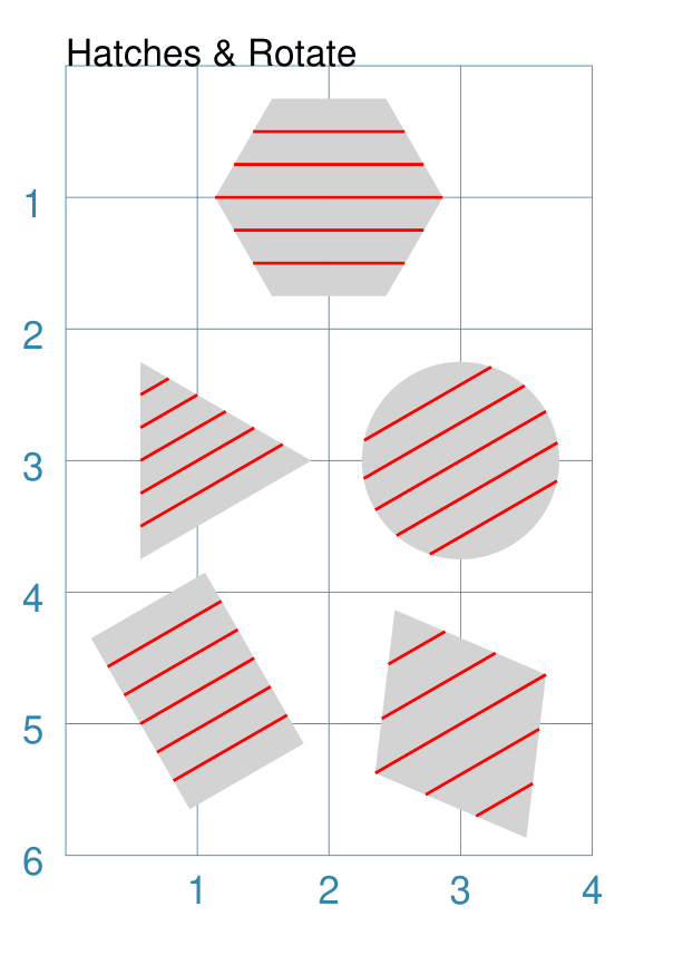
Radii Shapes
A number of shapes, that are formed by drawing lines between a set of vertices (“corner points”), can be styled by placing other shapes which can be located relative to those vertices.
Radii shapes are constructed using the following properties:
radii_shapes - this a list (values in
[...]) of value sets that determine the “where and what” should be drawn along the line of specific radius. Each set, enclosed in brackets(...)can consist of three comma-separated parts:the first is the direction, or directions, of the relevant radii; this can be a string e.g.
"n e"or a list e.g.["n", "e"]. Note that for aCirclethe direction is the number of degrees (anti-clockwise from 0° in the east direction) whereas for other shapes it will be a compass direction.the second is the shape to be drawn
the optional third part is the fractional distance along the line at which the shape should be drawn; by default this is
1i.e. the length of the radial line — if it is less than1the radii shape will be drawn inside of the parent shape; and if it is more than1the radii shape will be drawn outside of, or away from, the parent shape
radii_shapes_rotated - an optional property which, if
True, will rotate the vertex shapes such they lie along the line extending from the centre of the parent shape to that vertex
Radii shapes can be constructed for:
Example 1. Radii Shapes
|
This example shows radii shapes constructed as follows: ccom = Common(radius=0.15, fill="gold", label_size=6)
Hexagon(
cx=1, cy=1,
radius=0.8,
orientation="pointy",
radii_shapes=[
('n', circle(common=ccom, label="n")),
('se', circle(common=ccom, label="se"), 1.25),
('sw', circle(common=ccom, label="sw"), 0.5 ),
],
radii_shapes_rotated=True,
)
Hexagon(
cx=3, cy=1,
radius=0.8,
radii_shapes=[
('ne', circle(common=ccom, label="ne")),
('se', circle(common=ccom, label="se"), 1.25),
('sw', circle(common=ccom, label="sw"), 0.5),
],
radii_shapes_rotated=True,
)
Rectangle(
cx=1, cy=3,
height=1, width=1.5,
radii_shapes=[
('ne', circle(common=ccom, label="ne")),
('se', circle(common=ccom, label="se")),
('sw', circle(common=ccom, label="sw")),
('nw', circle(common=ccom, label="nw")),
],
radii_shapes_rotated=True,
)
Rhombus(
cx=3, cy=3,
width=1, height=1.5,
radii_shapes=[
('n', circle(common=ccom, label="n")),
('s', circle(common=ccom, label="s")),
('e', circle(common=ccom, label="e")),
('w', circle(common=ccom, label="w")),
],
radii_shapes_rotated=True,
)
Triangle(
cx=1, cy=5,
side=1.25,
radii_shapes=[
('n', circle(common=ccom, label="n")),
('se', circle(common=ccom, label="se")),
('sw', circle(common=ccom, label="sw")),
],
radii_shapes_rotated=True,
)
Circle(
cx=3, cy=5,
radius=0.75,
radii_shapes=[
('30 90 150 210 270 330',
circle(common=ccom, label="A")),
],
radii_shapes_rotated=True,
)
All of these examples use a common settings in Note that in some cases, setting the fractional_distance (the third value in the set) causes the radii shape to be moved closer to, or further away from, the centre. The use of Hint Although not shown above, multiple entries can be made for a given
direction; for example, to draw a circle and a dot along the Rectangle(
cx=1, cy=3,
height=1, width=1.5,
radii_shapes=[
('ne', circle(common=ccom, label="ne")),
('ne', dot(), 0.5),
],
radii_shapes_rotated=True,
)
|
Perbii Shapes
A number of shapes, that are formed by drawing lines between a set of vertices (“corner points”), can be styled by placing other shapes which can be located relative to the centre point of lines joining those vertices.
Perbii shapes are constructed using the following properties:
perbii_shapes - this a list (values in
[...]) of value sets that determine the “where and what” should be drawn along the line of specific perbis. Each set, enclosed in brackets(...)can consist of three comma-separated parts:the first is the direction, or directions, of the relevant perbii; this can be a string e.g.
"n e"or a list e.g.["n", "e"]. Note that this will be a compass direction.the second is the shape to be drawn
the optional third part is the fractional distance along the line at which the shape should be drawn; by default this is
1i.e. the length of the perbis line — if it is less than1the perbii shape will be drawn inside of the parent shape; and if it is more than1the perbii shape will be drawn outside of, or away from, the parent shape
perbii_shapes_rotated - an optional property which, if
True, will rotate the vertex shapes such they “point” away from the centre of the parent shape
Perbii shapes can be constructed for:
Note
Actually, because a Rhombus can have an “elongated” shape, it is not really possible to have true perbis lines for this shape. What is drawn are lines from the midpoints of each side to the centre. This in turn means that rotated shapes can seem to have an “awkward” angle — use with care. The same is true for any non-equilateral Triangle.
Example 1. Perbii Shapes
|
This example shows perbii shapes constructed as follows: ccom = Common(radius=0.15, fill="gold", label_size=6)
Hexagon(
cx=1, cy=1,
radius=0.8,
orientation="pointy",
perbii_shapes=[
('ne', circle(common=ccom, label="ne")),
('se', circle(common=ccom, label="se"), 1.25),
('w', circle(common=ccom, label="w"), 0.5 ),
],
perbii_shapes_rotated=True,
)
Hexagon(
cx=3, cy=1,
radius=0.8,
perbii_shapes=[
('n', circle(common=ccom, label="n")),
('se', circle(common=ccom, label="se"), 1.25),
('sw', circle(common=ccom, label="sw"), 0.5),
],
perbii_shapes_rotated=True,
)
Rectangle(
cx=1, cy=3,
height=1, width=1.5,
perbii_shapes=[
('n', circle(common=ccom, label="n")),
('s', circle(common=ccom, label="s.")),
('w', circle(common=ccom, label="w")),
('e', circle(common=ccom, label="e")),
],
perbii_shapes_rotated=True,
)
Rhombus(
cx=3, cy=3,
width=1, height=1.5,
perbii="ne se nw sw",
perbii_shapes=[
('ne', circle(common=ccom, label="ne")),
('se', circle(common=ccom, label="se")),
('nw', circle(common=ccom, label="nw")),
('sw', circle(common=ccom, label="sw")),
],
perbii_shapes_rotated=True,
)
Triangle(
cx=1, cy=5,
side=1.25,
perbii_shapes=[
('ne', circle(common=ccom, label="ne")),
('s', circle(common=ccom, label="s.")),
('nw', circle(common=ccom, label="nw")),
],
perbii_shapes_rotated=True,
)
All of these examples use a common settings in Note that in some cases, setting the fractional_distance (the third value in the set) causes the perbii shape to be moved closer to, or further away from, the centre. The use of As per the note above, the perbii_shapes for the Rhombus are aligned in the direction of the perbii lines and not with the shape’s edges. Hint Although not shown above, multiple entries can be made for a given
direction; for example, to draw a circle and a dot along the Rectangle(
cx=1, cy=3,
height=1, width=1.5,
perbii_shapes=[
('n', circle(common=ccom, label="n")),
('n', dot(), 0.5),
],
perbii_shapes_rotated=True,
)
|
Text Descriptions
Being able to associate a description, or identifier, with a shape can be useful.
There are three kinds of text that can be added to a shape, without having to specify their location or other details.
Note
Obviously, a Text shape can also be placed anywhere, including being superimposed on another shape, in order to handle more complex text needs.
The three “simple” text types that can be added to a shape are:
heading - this appears above the shape (slightly offset)
label - this appears in the middle of the shape
title - this appears below the shape (slightly offset)
All types are, by default, centred horizontally. Each type can be customised
in terms of its color, size and font family by appending _stroke, _size
and _font respectively to the text type’s name; so heading_font="Courier
will set the font family for the heading appearing above the shape.
The label text can, in addition, be moved relative to the shape’s centre by using the mx and my properties; positive values will move the text to the right and down; and negative values will move the text to the left and up.
Example 1. Heading, Label and Title
|
This example shows two shapes constructed using these commands to change default properties: Hexagon(
cx=2, cy=1.5, height=1.5,
title="Title",
label="Label",
heading="Heading")
Rectangle(
x=0.5, y=3, width=3, height=2,
label="red; size=14",
label_stroke="red", label_size=14)
The Hexagon shows where the heading, label and title appear relative to the shape’s boundaries, with default font size of 12 points. The Rectangle shows how the label can be customised in terms of its
stroke ( |
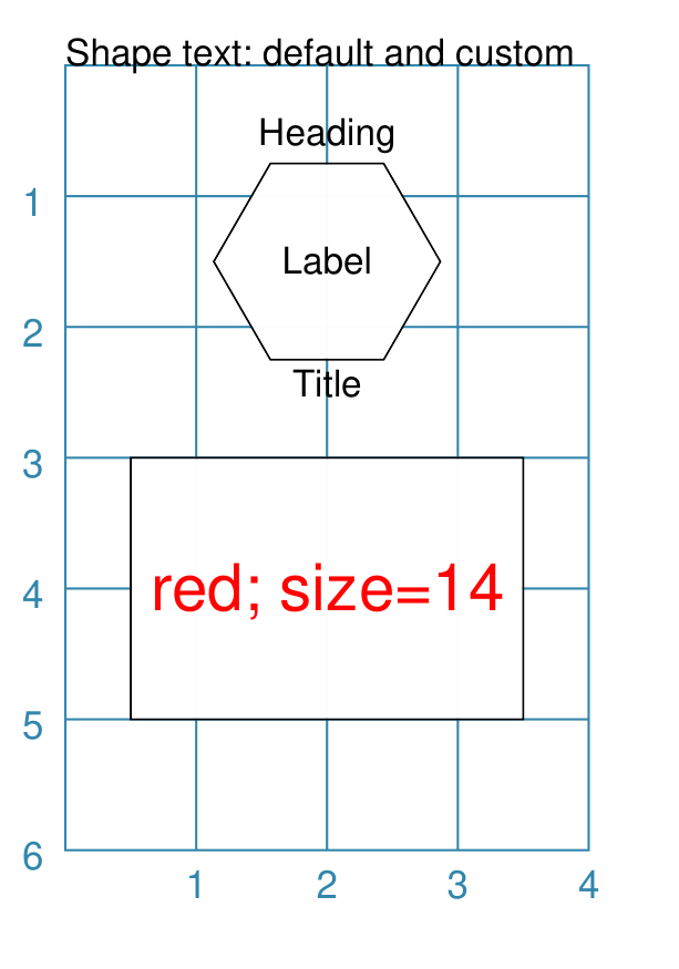
Example 2. Label Offsets
|
This example shows six Rectangles constructed using the command with additional properties: rct = Common(
height=1.0, width=1.75,
stroke_width=0.5, label_size=7)
Rectangle(
common=rct, x=0, y=0.0, label="offset -x, -y",
label_mx=-0.2, label_my=-0.2)
Rectangle(
common=rct, x=0, y=1.5, label="offset -x",
label_mx=-0.3)
Rectangle(
common=rct, x=0, y=3.0, label="offset -x, +y",
label_mx=-0.2, label_my=0.2)
Rectangle(
common=rct, x=2, y=0.0, label="offset +x, -y",
label_mx=0.2, label_my=-0.2)
Rectangle(
common=rct, x=2, y=1.5, label="offset +x",
label_mx=0.3)
Rectangle(
common=rct, x=2, y=3.0, label="offset +x, +y",
label_mx=0.2, label_my=0.2)
Rectangle(
common=rct, x=0, y=4.5, label="offset -y",
label_my=-0.2)
Rectangle(
common=rct, x=2, y=4.5, label="offset +y",
label_my=0.2)
Setting values for label_my and label_mx cause the label to shift away from centre. Positive values move the label down and to the right while negative values move it up and to the left. |
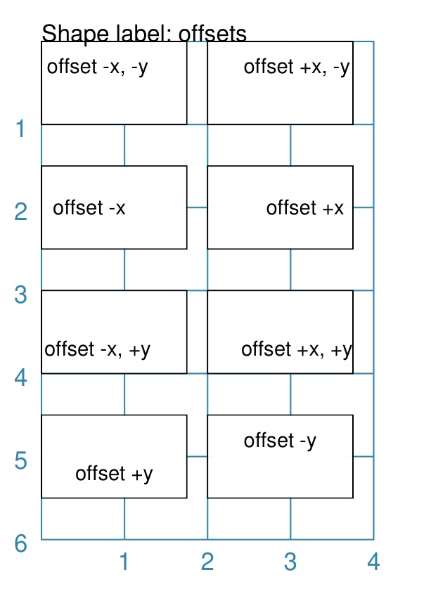
Transparency
All Enclosed Shapes, that have a fill, can have a transparency value set that will affect the fill color used for the area inside them.
If a shape needs to be completely transparent - i.e. no color at all being
visible - then set the fill value to None.
|
This example shows a number of Rectangles constructed as follows: Rectangle(
x=1, y=3, height=1, width=2,
fill="#008000", stroke="#C0C0C0",
transparency=25, label="25%")
Rectangle(
x=1, y=4, height=1, width=2,
fill="#008000", stroke="#C0C0C0",
transparency=50, label="50%")
Rectangle(
x=1, y=5, height=1, width=2,
fill="#008000", stroke="#C0C0C0",
transparency=75, label="75%")
Rectangle(
x=0, y=0, height=2, width=2,
fill="yellow", stroke="yellow")
Rectangle(
x=1, y=1, height=2, width=2,
fill="red", stroke="red",
transparency=50)
The three green Rectangles shapes have the following property set:
The red Rectangle, which also has a transparency value, is drawn partially over the yellow Rectangle on the upper-left. When overdrawn, there is a color change in the overlapping section i.e. “bleed through” occurs. |
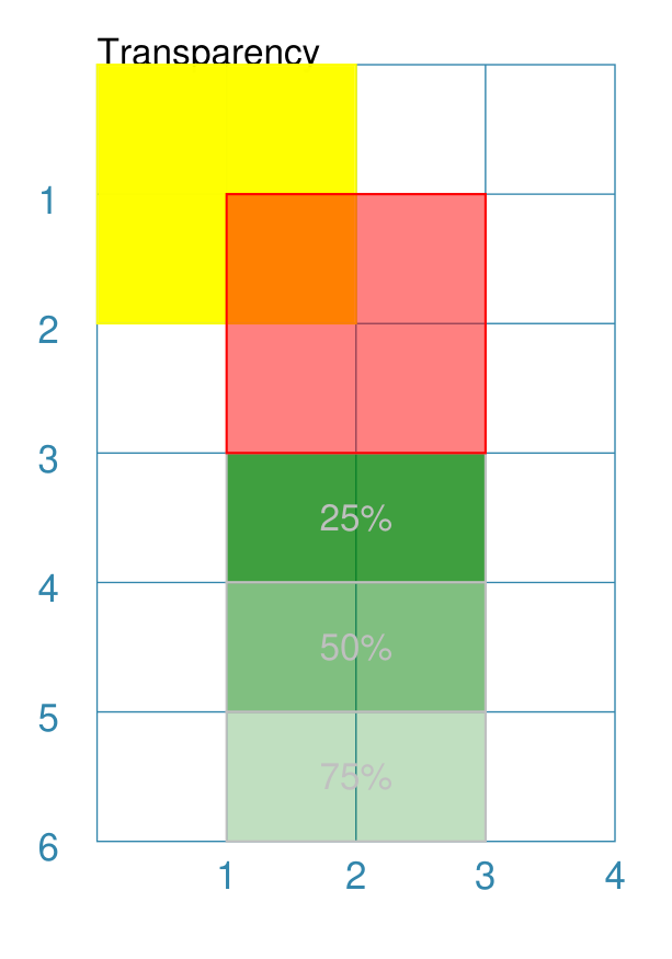
Centre Shape
Any shape that can be defined using its centre, may have another shape — called a “centre shape” — placed inside of it.
Note
In terms of drawing order, the “centre shape” is drawn after most of the shape’s other properties: only a dot, cross or label (if any of these are defined) will be drawn superimposed on the centre-shape.
Example 1. Default Centre Shape
|
This example shows a number of shapes constructed as follows: small_star = star(radius=0.25)
Polygon(
cx=1, cy=5, radius=0.5, sides=8,
centre_shape=small_star)
Triangle(
x=2.35, y=5.5, side=1.25,
centre_shape=small_star)
Rectangle(
x=0.5, y=2.5, height=1, width=1.25,
centre_shape=small_star)
Circle(
cx=3, cy=3, radius=0.5,
centre_shape=small_star)
Hexagon(
x=0.5, y=0.5, height=1,
centre_shape=small_star)
Square(
x=2.5, y=0.5, height=1,
centre_shape=small_star)
At the start, a Star shape is defined by the lowercase A lowercase command means the shape is not drawn at this time but is assigned to a named value and can be referred to further on. Each of the other shapes in the script can now use this named shape
as their Regardless of whether the primary shape’s position is
defined using |
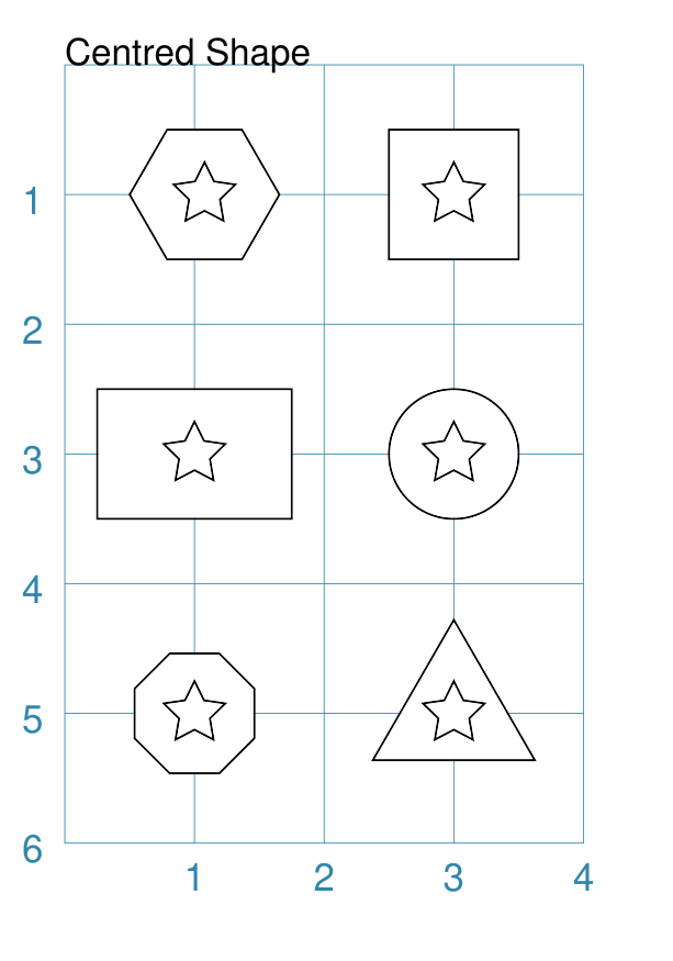
Example 2. Off-Centre
The centre-shape can be shifted from the centre by setting values for centre_shape_mx and centre_shape_my.
|
This example shows two Hexagon shapes constructed as follows: small_star = star(radius=0.25)
small_circle = circle(
radius=0.33, fill="gray",
centre_shape=small_star)
Hexagon(
x=1, y=0.5, height=2,
hatches_count=5,
dot=0.1,
centre_shape=small_circle)
Hexagon(
x=1, y=3, height=2,
centre_shape=small_circle,
centre_shape_mx=0.3, centre_shape_my=0.6)
As in the first example, the The This The upper Hexagon shows how the centre-shape is drawn
over other features, such as the hatches, in the Hexagon,
except for the The lower Hexagon shows how the centre-shape can be moved with the
Positive values move the shape down and to the right while negative values move it up and to the left. |
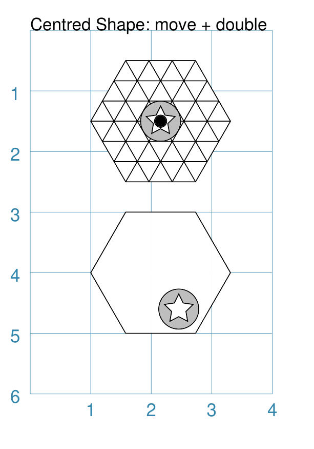
Example 3. Customised Centres
The centre-shape can be any type of shape that has a defined centre; and this shape itself can be customised.
|
This example shows Rectangle shapes, each constructed with a
Rectangle(x=0, y=1, side=1,
          centre_shape=polygon(
              radius=0.4,
              sides=7,
              fill=None,
              perbii='*',
              stroke="red"))
Rectangle(x=1, y=2, side=1,
          centre_shape=circle(
              radius=0.3,
              radii=[0,60,120,180,240,300],
              fill=None,
              stroke="green"))
Rectangle(x=2, y=1, side=1,
          centre_shape=hexagon(
              radius=0.4,
              stroke="purple",
              fill=None,
              borders=[("sw n se", 2)]))
Rectangle(x=3, y=2, side=1,
          centre_shape=stadium(
              side=0.4,
              stroke="orange"))
Rectangle(x=0, y=3, side=1,
          centre_shape=ellipse(
              height=0.8,
              width=0.5,
              fill=None,
              stroke="olive"))
Rectangle(x=1, y=4, side=1,
          centre_shape=square(
              side=0.6,
              stroke="gold",
              fill=None,
              hatches='d', hatches_count=5,
              borders=[("n s", 2, "black")]))
Rectangle(x=2, y=3, side=1,
          centre_shape=rhombus(
              side=0.8,
              stroke="gray",
              fill=None,
              borders=[("ne sw", 2, "black")]))
Rectangle(x=3, y=4, side=1,
          centre_shape=trapezoid(
              width=0.6, top=0.4, height=0.8,
              stroke="aqua",
              fill=None,
              flip='south',
              borders=[("e w", 2, "black")]))
These various shapes and their custom properties are described elsewhere in the documentation; this example just serves to show how they can be used together. |
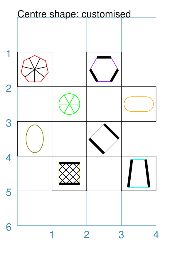
Centre Shapes
Any shape that can be defined using its centre, may have multiple shapes — called “centre shapes” — placed inside of it.
Centre shapes are constructed using the following properties:
centre_shapes - this is a list (values in
[...]) of shapes that should be placed at the centre, in order of drawing; for example[(shape1), (shape2)]centre_shapes_rotated - an optional setting which, if
True, will rotate the centre shapes to align with the shape’s rotation (if any)
Note
In terms of drawing order, the “centre shapes” are drawn after most of the shape’s other properties: only a dot, cross or label (if any of these are defined) will be drawn superimposed on the centre shapes.
Example 1. Centres
Any centre-shape can be shifted from the centre by setting values for
the change in x and y values as part of the set.
|
This example shows centre shapes constructed as follows: small_dot = dot(dot_width=4, fill="red")
big_dot = dot(dot_width=8)
Hexagon(
x=0.5, y=0.5, height=1,
centre_shapes=[
(small_dot), (big_dot, 0.2, 0.2)])
Rhombus(
x=2.4, y=0.3,
height=1.5, width=1.25,
centre_shapes=[
(small_dot), (big_dot, 0.2, 0.2)])
Rectangle(
x=0.5, y=2.5,
height=1, width=1.25,
centre_shapes=[
(small_dot), (big_dot, 0.2, 0.2)])
Circle(
cx=3, cy=3,
radius=0.5,
centre_shapes=[
(small_dot), (big_dot, 0.2, 0.2)])
Polygon(
cx=1, cy=5,
radius=0.5, sides=8,
centre_shapes=[
(small_dot), (big_dot, 0.2, 0.2)])
Triangle(
x=2.35, y=5.5, side=1.25,
centre_shapes=[
(small_dot), (big_dot, 0.2, 0.2)])
At the start, two Dot shapes are defined by the lowercase A lowercase command means the shapes are not drawn at this time but assigned to named values and can be referred to further on. Each of the other shapes in the script can now use these named shapes
as their The |
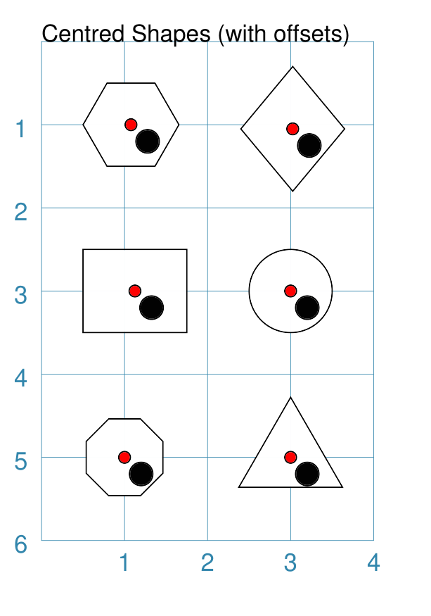
Vertex Shapes
A number of shapes, that are formed by drawing lines between a set of vertices (“corner points”), can be styled by placing other shapes which will be centered on those points.
Vertex shapes are constructed using the following properties:
vertex_shapes - this is a list (values in
[...]) of shapes that should be placed on vertices, in the order that these vertices are drawn; for example[(shape1), (shape2)]vertex_shapes_rotated - an optional setting which, if
True, will rotate the vertex shapes such they “point” away from the centre of the parent shape and towards the vertex
Vertex shapes can be constructed for:
Example 1. Vertex Shapes
|
This example shows vertex shapes constructed as follows: Rectangle(
cx=1, cy=1,
height=1,
width=1.5,
vertex_shapes=[
circle(radius=0.15, label="R")] * 4,
vertex_shapes_rotated=True)
Hexagon(
cx=3, cy=1,
radius=1,
vertex_shapes=[
circle(radius=0.15, label="H")] * 6,
vertex_shapes_rotated=True)
Polygon(
cx=1, cy=3,
sides=5,
radius=1,
vertex_shapes=[
circle(radius=0.15, label="P")] * 5,
vertex_shapes_rotated=True)
Trapezoid(
cx=3, cy=3,
width=1.5, top=1, height=1.25,
vertex_shapes=[
circle(radius=0.15, label="T")] * 5,
vertex_shapes_rotated=True)
Triangle(
cx=1, cy=5,
side=1.5,
vertex_shapes=[
circle(radius=0.15, label="E")] * 3,
vertex_shapes_rotated=True)
Star(
cx=3, cy=5,
radius=1,
rays=5,
vertex_shapes=[
circle(radius=0.15, label="S")] * 5,
vertex_shapes_rotated=True)
All of these examples use the shortcut approach to create the correct
number of vertex shapes i.e. The use of |
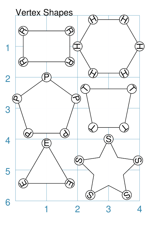
Wave Styles
A number of shapes, that make use of straight line properties, can be styled using their “wave” property.
These include the radii and perbii properties of Circle, Hexagon, Polygon and Rectangle (for details on those properties, see the section on Customised Shapes). In addition, the lines used to construct a Polyshape and Polyline can also be styled like waves.
Example 1. Radii and perbii
|
This example shows various shapes constructed as follows: Line(
x=0, y=0.5, length=1.5,
stroke="purple", stroke_width=1,
wave_style='wave', wave_height=0.1
)
Line(
x=2, y=0.5, length=1.5,
stroke="firebrick", stroke_width=1,
wave_style='sawtooth', wave_height=0.1
)
Polygon(
perbii_stroke="purple",
perbii_stroke_width=1,
perbii_wave_style='wave',
perbii_wave_height=0.1,
cx=1, cy=1.5, sides=8, radius=0.75,
perbii="2,4,7"
)
Polygon(
radii_stroke="firebrick",
radii_stroke_width=1,
radii_wave_style='sawtooth',
radii_wave_height=0.1,
cx=3, cy=1.5, sides=8, radius=0.75,
radii="*")
Rectangle(
perbii_stroke="purple",
perbii_stroke_width=1,
perbii_wave_style='wave',
perbii_wave_height=0.1,
cx=1, cy=3.25, height=1, width=2,
perbii="n s e w",
)
Circle(
radii_stroke="firebrick",
radii_stroke_width=1,
radii_wave_style='sawtooth',
radii_wave_height=0.1,
cx=3, cy=3.25, radius=0.75,
radii=[60, 180, 300],
)
Hexagon(
cx=1, cy=5, radius=0.75,
perbii='*',
perbii_stroke="purple",
perbii_stroke_width=1,
perbii_wave_style='wave',
perbii_wave_height=0.1
)
Hexagon(
cx=3, cy=5, radius=0.75,
radii="ne se w",
radii_stroke="firebrick",
radii_stroke_width=1,
radii_wave_style='sawtooth',
radii_wave_height=0.1
)
The purple lines have:
The dark red lines have:
|
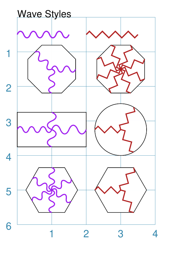
Example 2. Polyshape and Polyline
|
This example shows poly-shapes constructed as follows: Polyshape(
points=[(1,2), (1,1), (2 0), (3,1), (3,2)],
wave_style="wave", wave_height=0.03,
fill="gold")
Polyline(
points='1,3 1,4 2,4 4,3',
stroke="red", stroke_width=2,
wave_style="sawtooth", wave_height=0.03)
Polyline(
points='1,5 1,6 2,6 4,5',
stroke="purple", stroke_width=2,
wave_style="wave", wave_height=0.05)
The top Polyshape, with a default line stroke, has:
The dark red thick Polyline has:
The purple thick Polyline has:
|